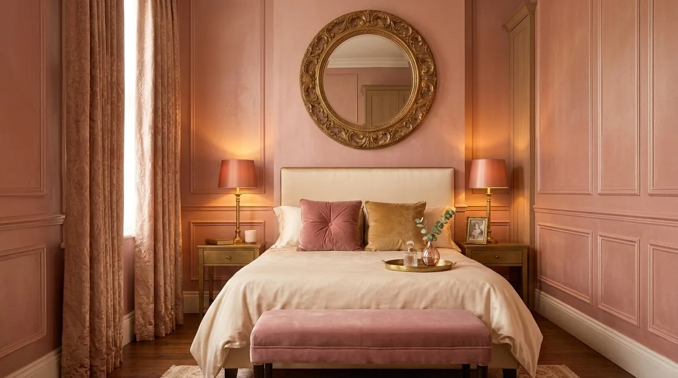
15 Pink Bedroom Designs That Look Luxurious
Pink bedroom designs that look luxurious use the full spectrum of pink — from barely-there dusty blush through warm rose and deep terracotta-adjacent mauve to rich jewel-toned raspberry — not as a color associated with a single demographic or a specific decade but as a genuinely sophisticated chromatic family with more design range, more material compatibility, and more atmospheric potential than its cultural reputation suggests. This article gives you exactly 15 designs spanning material-led blush environments, deep jewel pink statement rooms, architectural pink applications, and the specific combinations of pink with natural materials, warm metals, and botanical elements that produce the specific quality of luxurious warmth that the best pink bedrooms achieve.
A pink bedroom that looks luxurious is not pink by default — it is pink by decision, with every other material choice made in response to the specific pink chosen, every metallic finish calibrated to warm or cool the pink’s undertone, and every textile layer building the material depth that converts a color decision into an atmospheric one. Here are 15 designs worth considering.
Why Pink Bedroom Designs Look Luxurious
The cultural history of pink in domestic interiors is more nuanced than its contemporary reputation suggests. Before the mid-20th century’s gendering of the color spectrum, pink (as a warm, light red) was associated in European interior design with warmth, vitality, and baroque abundance — the salmon and rose tones of 18th-century French interior design, the warm coral and terracotta pinks of Italian Renaissance domestic interiors, and the deep madder and raspberry tones of Victorian upholstered furniture all drew from the pink spectrum as a warm jewel color rather than a gender-specific code. The contemporary luxury interior’s return to pink — documented as a sustained design trend in premium residential projects from approximately 2016 onward — draws precisely on this pre-gendering history, using pink as a warm material color with the same design authority as forest green, deep navy, or warm terracotta.
The specific reason pink works in luxury bedrooms is its relationship to skin tone: pink is, across the full spectrum from palest blush to deepest rose, the color family most closely related to human skin, and its presence in a bedroom environment creates the specific warmth that designers describe as “flattering” — rooms that make the people within them look and feel more radiant rather than more pallid. This is a genuinely functional quality in a bedroom context, where the morning and evening light and the mirror’s reflection are significant parts of the daily experience. A warm blush or rose bedroom does not just look beautiful — it feels beautiful to inhabit.
Style at a Glance
| Element | Luxury Pink Core | Design Edge |
|---|---|---|
| Philosophy | Pink as warm jewel color, not gendered default | Every material chosen in response to the pink |
| Spectrum | Dusty blush → warm rose → deep mauve → raspberry | Undertone determines all companion materials |
| Key Companions | Aged brass, natural linen, warm marble, deep green |
15 Pink Bedroom Designs That Look Luxurious
1. Dusty Blush Linen — The Barely-There Luxury
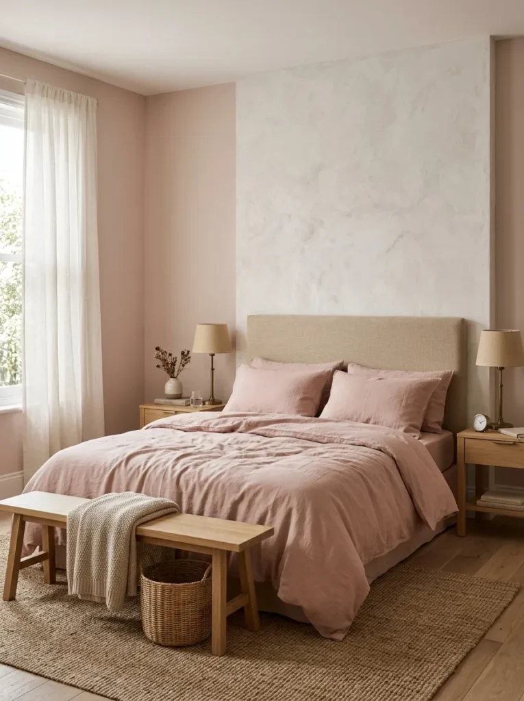
Vibe: The dusty blush bedroom feels like the most confident possible use of the quietest possible pink — the tonal blush layering creating a room of genuinely enveloping warmth without a single element that could be called obviously pink.
Why it works: Tonal blush layering — walls, bedding, and soft furnishings in the same barely-there dusty blush family — applies the chromatic immersion principle at its most restrained. When wall, bedding, and upholstery exist in the same very close color family (slight variation in value and saturation between them rather than dramatic contrast), the room reads as a single warm material environment rather than a room with pink things in it. The specific value of dusty blush at this threshold is that it reads as warm white in some lights and as unambiguously pink in others — the color appears and retreats with the changing quality of natural light throughout the day, making the room dynamically interesting without ever being assertively colored.
The aged brass calibration: Aged brass specifically (not polished brass, not satin brass) is the metallic that coordinates most precisely with dusty blush — the warm bronze-gold of aged brass amplifies the pink’s warm yellow undertone rather than conflicting with it, creating the specific combination that reads as genuinely luxurious rather than simply coordinated.
Quick Win: Replace existing white or gray bedding with dusty blush linen pillowcases and a dusty blush linen duvet cover while keeping all other elements unchanged. The blush bedding in an otherwise neutral bedroom creates an immediate warm shift in the room’s atmosphere that costs less than $120.
Shop The Look
| Product |
|---|
| Dusty blush matte bedroom paint |
| Washed linen duvet cover dusty blush |
| Linen pillowcase set dusty blush |
| Aged brass table lamp pair |
| Natural oak bedside table pair |
Also view: 15 Dreamy Luxe Bedroom Ideas for Elegant Living
2. Deep Rose Velvet — Statement Headboard
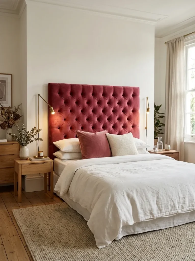
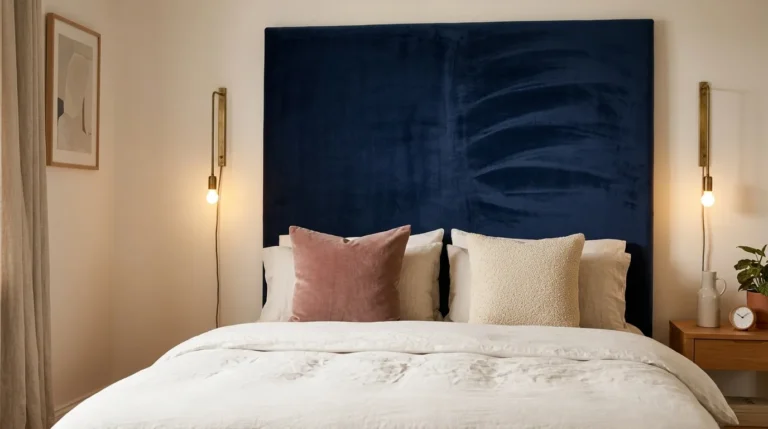
Vibe: The deep rose velvet headboard feels like the bedroom decided to have one opinion and commit to it entirely — the oversized jewel-toned velvet creating the room’s complete design statement without requiring any supporting element to compete.
Why it works: An oversized deep rose velvet headboard that extends to near-ceiling height applies the architectural textile principle — at 180×140cm, the headboard occupies the same visual scale as a significant piece of art or an architectural feature rather than reading as furniture. The velvet’s pile creates the directional light quality that makes the deep rose appear several shades lighter or darker as the room’s light source shifts throughout the day — a static color that nonetheless reads as dynamic. The warm white wall and white linen bedding provide the maximum chromatic contrast that allows the rose velvet to be read at its fullest color intensity, while the cream boucle cushion introduces a neutral texture that softens the transition from the deep velvet to the white linen.
Upholstery specification: Deep rose velvet for a headboard requires an upholstery-weight performance velvet with a Martindale rub count of at least 30,000 — the headboard receives friction from hair and pillows and requires the durability of a true upholstery-grade fabric. Specify the pile direction running downward (top to bottom) for the most consistent color depth across the full headboard surface.
Shop The Look
| Product |
|---|
| Deep rose velvet upholstery fabric |
| Oversize headboard plywood form |
| Aged brass wall reading light pair |
| Walnut bedside table pair |
| Warm oat wool area rug large |
3. Blush and Warm Marble — Material Luxury Pairing
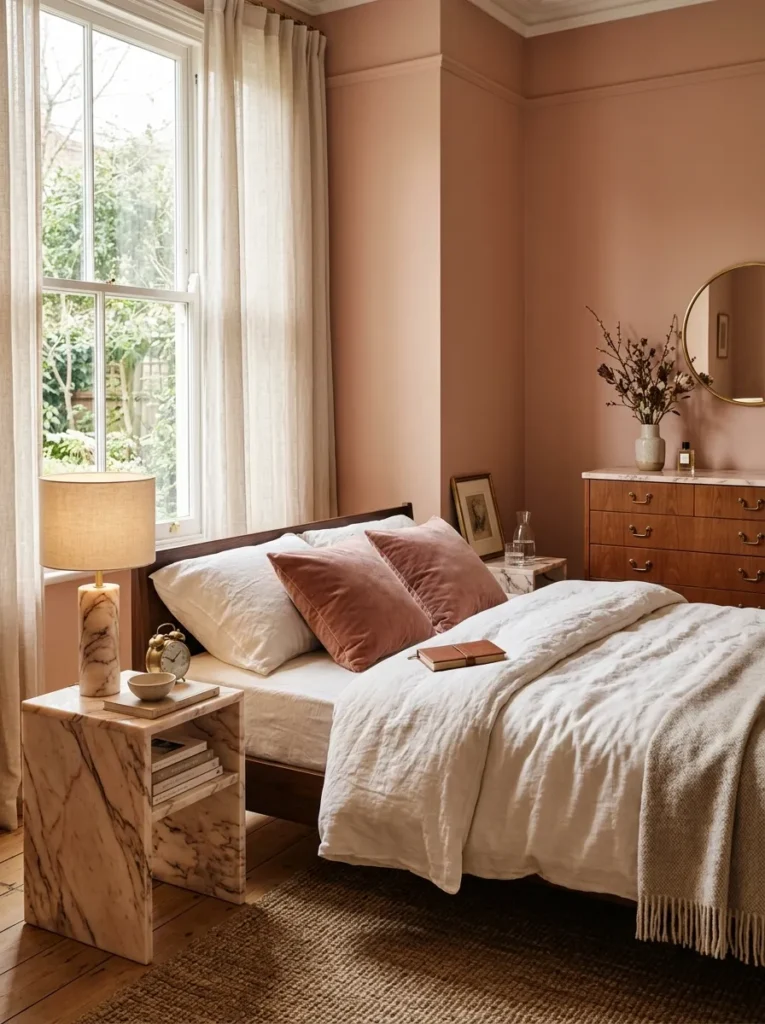
Vibe: The blush and marble bedroom feels like the room assembled itself from materials that were already in conversation — the warm pink veining in the marble referencing the wall color in a geological material that predates the room by millennia.
Why it works: A blush wall and warm marble pairing applies the material color resonance principle — when the wall paint color and a natural material both draw from the same chromatic family (the warm pink-rose spectrum), the room creates a material dialogue where the color appears in both manufactured (paint) and geological (stone) form simultaneously. This simultaneous appearance of the same color across different material registers — the matte pigment of the painted wall and the veined, translucent depth of the marble — creates a material richness that no single-material room can produce. Warm marble specifically (Portuguese Rose, Rosso Levanto, Calacatta Rosa, or Statuario with warm veining) has sufficient warm pink presence to create this resonance without being so overtly pink that the material dialogue becomes a color matching exercise.
Shop The Look
| Product |
|---|
| Warm blush paint rose-beige matte |
| Warm veined marble bedside table |
| Marble lamp base warm cream |
| Aged brass dresser handle set |
| Dusty rose velvet cushion pair |
4. Pale Pink Ceiling — The Unexpected Overhead
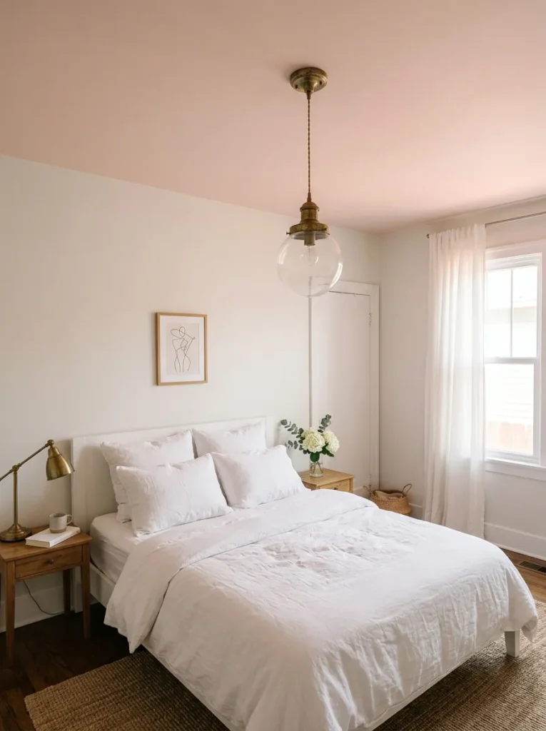
Vibe: The pale pink ceiling feels like the room received warm afternoon light from above as a permanent condition — the ceiling’s blush creating a wash of warmth that the room’s white surfaces reflect and amplify throughout the day.
Why it works: A pale pink ceiling in an otherwise white bedroom applies the chromatic light source principle — a colored ceiling acts as a secondary light source when natural light strikes it, bouncing color-tinted reflected light back into the room. A pale blush pink ceiling bounces a warm pink-amber reflected light downward, creating the specific quality of warmth that pink-veined marble produces in a sunlit room — a warm glow from an above source that is not direct light but reflected and softened color. This effect is most pronounced in rooms with white walls and white furnishings (which receive and display the reflected ceiling color most clearly) and is most visible in the hours of direct sunlight through windows positioned to illuminate the ceiling surface.
Paint specification: The ceiling pink must be pale enough to read as warm cream in low light while being detectable as blush in strong natural light — approximately one-fifth of the saturation of the wall paint chosen for a full pink bedroom. A formula of 5% warm rose pigment in a standard ceiling white base achieves this threshold.
Shop The Look
| Product |
|---|
| Pale blush pink ceiling paint |
| Warm white wall paint complement |
| All-white linen duvet and pillows |
| Aged brass ceiling pendant |
| White bedroom furniture complement |
5. Raspberry and Deep Forest Green — The Jewel Contrast
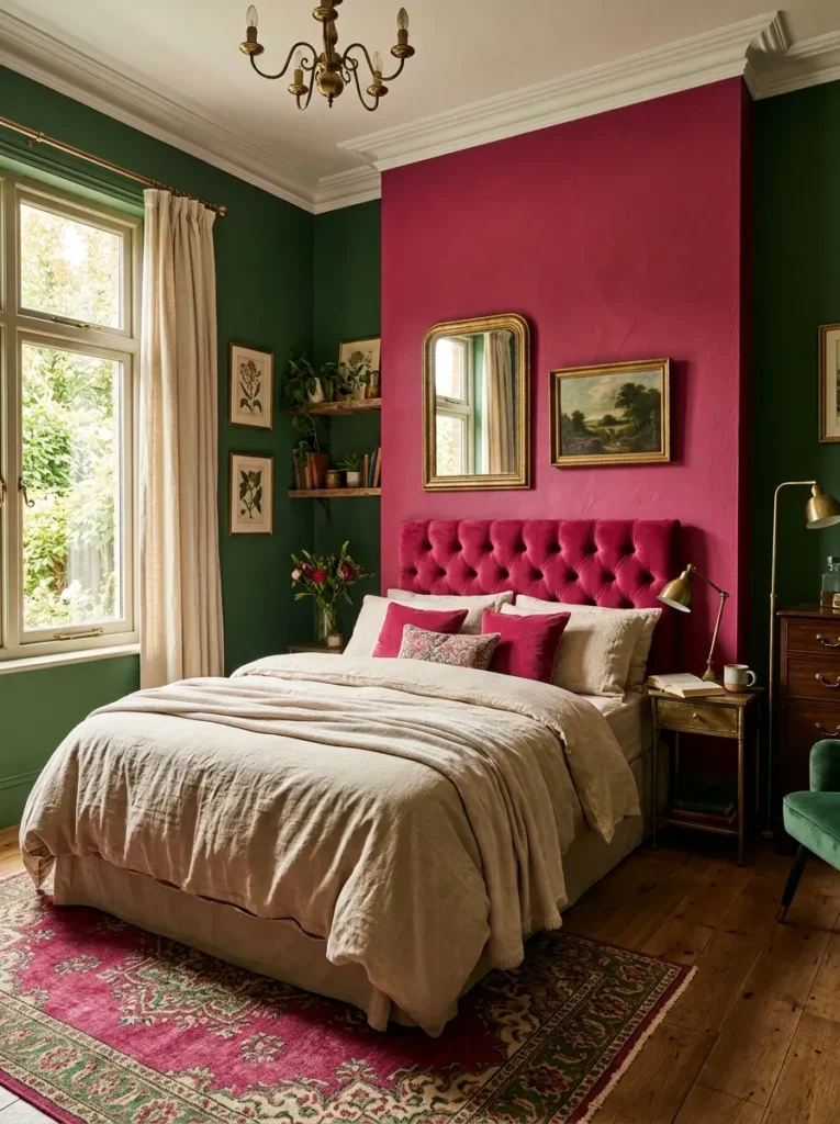
Vibe: The raspberry and green bedroom feels like a room that decided the conventional advice about mixing bold colors was wrong and proved it — the two jewel tones at equivalent depth creating a mutual intensification rather than a competition.
Why it works: A raspberry and deep forest green bedroom applies the complementary jewel contrast principle — raspberry (a warm pink with slight blue-red undertone) and forest green (a warm deep green with yellow-green undertone) sit in a warm complementary relationship on the color wheel, meaning each color makes the other appear more vivid and more saturated when viewed in proximity. The specific reason this combination reads as luxurious rather than chaotic is that both colors are at the same high-saturation, deep-value register — neither is a pastel and neither is a neon. When two equally deep, equally warm jewel colors occupy the same room, the visual system reads them as belonging together rather than competing, creating the specific quality of chromatic abundance that jewel-box interior design achieves.
The cream neutralizer: The cream or oat linen bed positioned between the two colored walls provides the neutral visual rest point that prevents the room from reading as overwhelming. The cream functions as a chromatic pause — the eye moves from raspberry to cream to green and back, the cream providing the interval that makes the jewel contrast readable rather than relentless.
Shop The Look
| Product |
|---|
| Raspberry pink matte wall paint |
| Deep forest green matte wall paint |
| Cream oat linen duvet cover |
| Aged brass lamp and hardware set |
| Warm cream boucle cushion |
6. Warm Terracotta-Pink — The Earth-Tone Pink
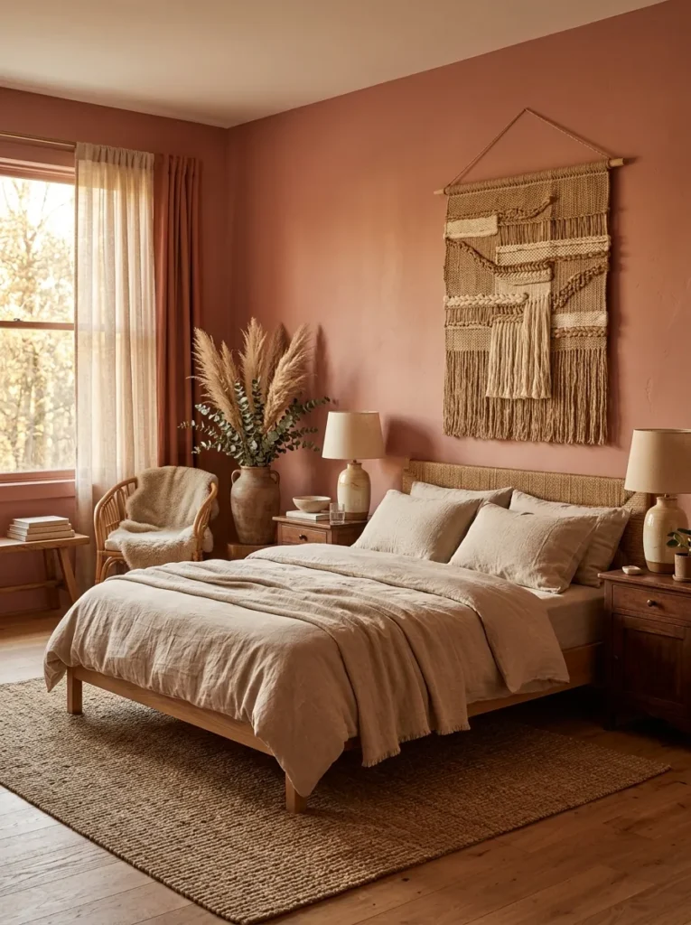
Vibe: The terracotta-pink bedroom feels like the room was built from local clay by someone who understood color — the earth-tone pink creating the specific warmth of a sun-baked Mediterranean interior.
Why it works: A terracotta-adjacent pink applies the earth-tone warm pink principle — the terracotta-pink color family (shades that contain both the orange-brown warmth of terracotta and the pink’s red component) produces a pink that reads as genuine without reading as sweet or pastel. The yellow-orange undertone in this pink family makes it coordinate naturally with natural materials (undyed linen, raw ceramic, dried botanical, woven textile) in a way that cooler pinks cannot, because all these natural materials share the same warm yellow-earth undertone. This creates the specific material coherence of a room where every element seems to have come from the same geological family — the clay of the walls, the clay of the ceramic lamp, the dried grass of the botanical, the woven fiber of the textile, all in the same warm earth-tone register.
Shop The Look
| Product |
|---|
| Terracotta pink matte clay rose paint |
| Natural oat linen duvet cover |
| Hand-thrown ceramic lamp pair |
| Dried pampas and eucalyptus tall vase |
| Natural woven textile wall hanging |
7. Powder Pink and Warm Walnut — The Contemporary Pairing
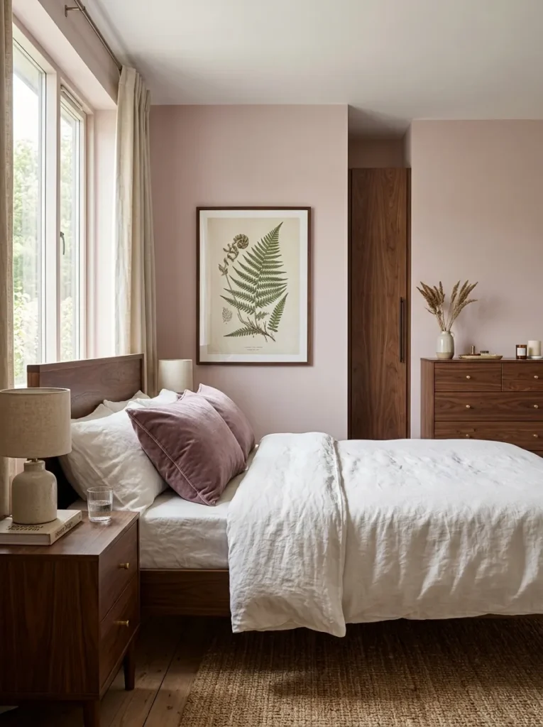
Vibe: The powder pink and walnut bedroom feels like a room that understood that pink needs contrast rather than coordination — the deep warm walnut making the powder pink appear more sophisticated by creating the dark-light opposition that reveals the pink’s true tone.
Why it works: Powder pink with dark walnut furniture applies the chromatic contrast principle — a pink wall color is most precisely perceived when it is placed adjacent to a material of significantly different value (lightness or darkness) that provides a reference point for the pink’s specific tone. Dark walnut (a deep warm brown) creates maximum value contrast with pale powder pink, making the pink appear at its truest and most precise color — neither washed out (as it might appear against white) nor overwhelmed (as it might against a competing strong color). The gray-mauve undertone of this specific powder pink reads against the walnut’s warm brown as a genuinely cool pink, creating the contemporary cool-warm tension that distinguishes considered color pairings from safe ones.
Shop The Look
| Product |
|---|
| Powder pink gray-mauve matte paint |
| Walnut bedside table pair dark |
| Walnut low dresser bedroom |
| Dusty mauve velvet cushion large |
| Slim walnut frame botanical print |
8. All-Pink Maximalist — Full Commitment
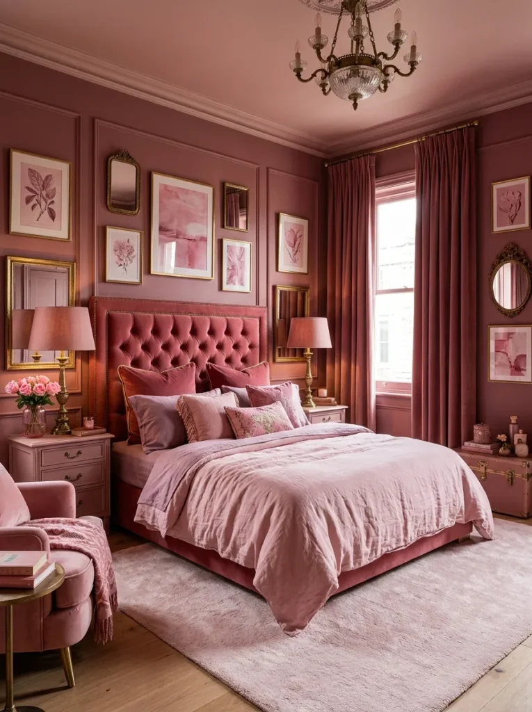
Vibe: The all-pink bedroom feels like the room decided to be unapologetically itself without asking permission — the full pink commitment creating a chromatic immersion that stops being overwhelming and becomes genuinely enveloping.
Why it works: An all-pink bedroom with tonal variation applies the maximalist coherence principle — the specific risk of an all-pink room is monotony (one flat pink everywhere) and the specific solution is tonal variation (multiple pinks at different values and saturations, all within the same pink family). Deep dusty rose walls, a lighter rose ceiling, a pale blush rug and duvet, a fully saturated raspberry velvet headboard, and rose curtains together create a room whose pink is experienced as a continuous warm immersion rather than as a repeated single application. The one non-pink element — aged brass hardware — is the chromatic anchor that prevents the room from reading as a pink room with no other references, providing the warm metallic note that makes the varied pinks read as a designed palette rather than an accumulation.
Shop The Look
| Product |
|---|
| Deep dusty rose wall paint |
| Blush linen duvet and pillowcase set |
| Raspberry velvet headboard fabric |
| Rose velvet ceiling-height curtains |
| Pale blush area rug large |
9. Pink and Gold — Warm Metal Luxury
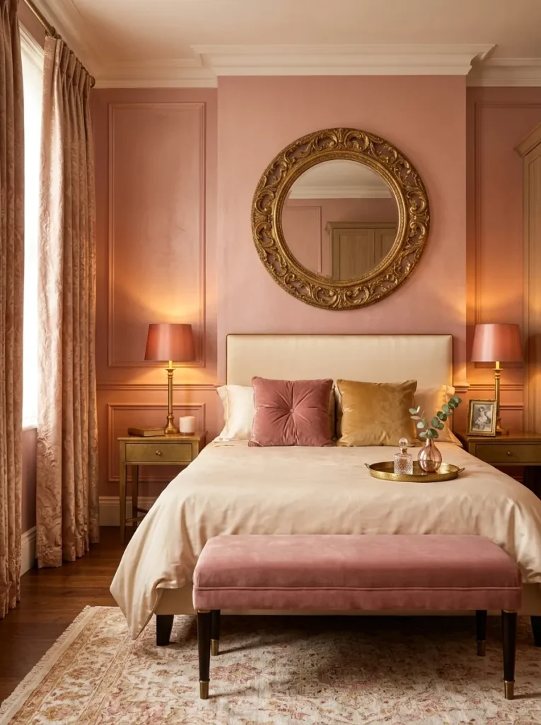
Vibe: The pink and gold bedroom feels like warmth rendered as a design system — the rose and gold occupying the same warm color temperature, the room producing a unified warmth from two distinct materials.
Why it works: A pink and gold bedroom applies the warm color temperature unity principle — when the wall color (rose-gold pink), the metallic finish (warm gold, aged brass), and the textile colors (dusty rose velvet, warm cream silk) all share the same warm color temperature (all leaning yellow-orange rather than blue-cool), the room produces an effect of absolute warmth unity. This unity is the specific quality of luxury that gold-dominant interior design has always produced — from the gilded salons of 18th-century European aristocratic interiors to the contemporary residential luxury projects of Kelly Wearstler and India Mahdavi. The warm pink wall specifically (a pink with visible gold undertone, sitting between blush and copper) is the wall color that coordinates most completely with warm gold metallic finishes because the two colors share the yellow-warmth of their undertones.
Silk specification: Warm cream silk or silk-effect sateen (a cotton-polyester blend woven in the sateen structure that produces silk’s characteristic sheen) provides the surface light quality that linen and cotton cannot — the sateen weave reflects light differently from different angles, creating a surface that reads as warm white in one light and slightly warm gold in another, directly referencing the room’s gold palette in the bed’s surface material.
Shop The Look
| Product |
|---|
| Rose-gold pink warm wall paint |
| Large gold frame circular mirror |
| Dusty rose velvet bench upholstered |
| Gold finish lamp warm rose shade |
| Warm cream silk sateen duvet cover |
10. Blush and Natural Linen — The Minimal Luxury
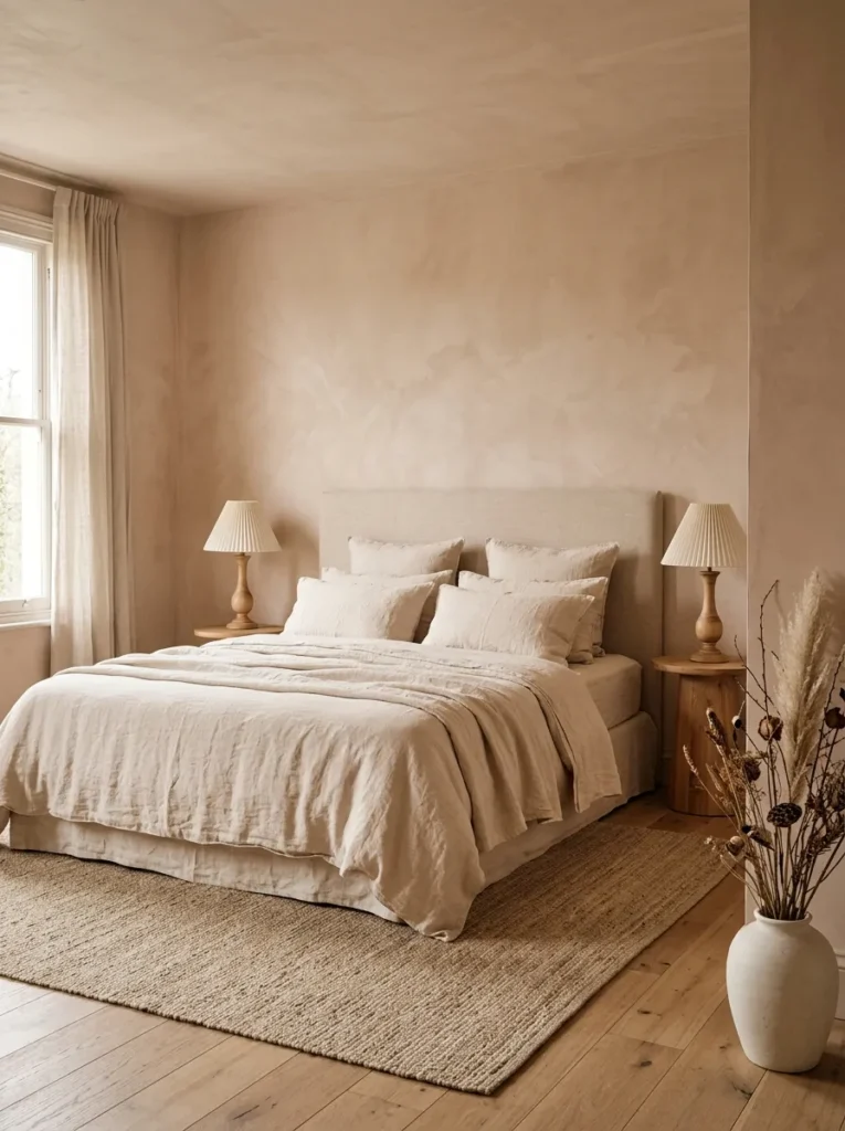
Vibe: The blush minimal bedroom feels like luxury that came from restraint rather than addition — the bare plaster walls and raw undyed linen creating a material richness through absolute honesty about what the materials actually are.
Why it works: A bare plaster or limewash wall with raw undyed linen bedding applies the natural material blush principle — unpigmented wall plaster and raw undyed linen share a specific pink-adjacent warmth that is not applied as a design decision but inherent to the materials themselves. Natural plaster’s warm pink-cream (the result of the calcium and mineral content of the plaster composition) and raw linen’s warm cream (the result of the flax fiber’s natural color before bleaching or dyeing) together create a room that reads as blush without a single gram of pink pigment having been added. This natural blush is the most sophisticated possible pink because it exists in the material rather than on it — it cannot be imitated by pink paint applied to a standard substrate.
Shop The Look
| Product |
|---|
| Limewash bare plaster effect paint |
| Raw undyed linen duvet cover |
| Raw linen pillowcase set natural |
| Turned natural wood lamp base pair |
| Simple cream lampshade pair |
11. Mauve and Antique Brass — The Vintage Luxury
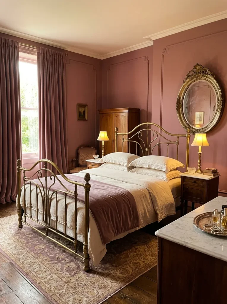
Vibe: The mauve and antique brass bedroom feels like a room that survived the 19th century with its taste intact — the warm mauve and aged metallic creating the specific patina of genuinely old luxury rather than its contemporary simulation.
Why it works: Mauve with antique brass applies the historic warm pink principle — mauve (which was the first synthetic dye color, discovered by William Henry Perkin in 1856, and rapidly adopted in Victorian interior design as a fashionable warm purple-pink) has a specific historic resonance that positions it within a tradition of considered color use rather than trend-responsive decoration. Combined with antique brass (the unlacquered or heavily patinated brass that reads as genuinely aged rather than newly installed), mauve creates an interior that references the specific material culture of late 19th-century domestic luxury — the velvet curtains, the brass bed, the oval mirror — without reproducing it literally. The specific pink family reading of mauve (as warm pink with purple undertone rather than as purple with pink undertone) is determined by the yellow-warmth in the base paint specification — a mauve with yellow-warm base reads as historic pink; one with blue-cool base reads as contemporary purple.
Shop The Look
| Product |
|---|
| Warm mauve matte paint yellow-base |
| Antique brass bed frame curved |
| Ivory linen embroidered pillowcase |
| Distressed gold oval wall mirror |
| Antique brass candlestick lamp pair |
12. Pink and Cream Plaster — The Organic Luxury
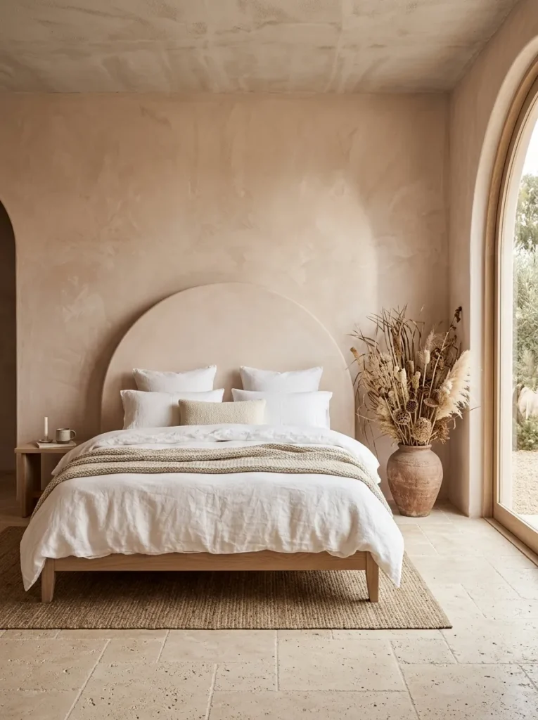
Vibe: The plaster pink bedroom feels like the room was formed rather than decorated — the pigmented plaster creating a pink that exists within the material rather than on its surface.
Why it works: A pigmented plaster or micro-cement pink wall applies the material depth principle — polished plaster or micro-cement with pink pigment incorporated into the mix creates a wall surface whose color has depth (visible at different values and saturations depending on the angle of the light) rather than the flat, single-value application of paint. Natural light raking across a polished plaster surface creates moving shadow and highlight across the plaster’s slight texture variations, animating the pink so that the room’s color appears to shift throughout the day with the changing light. This quality — color that appears different in morning light than afternoon light, in natural light than lamp light — is one of the specific signatures of genuinely luxury interior specification.
The arch headboard: The arch form executed in matching plaster material (the headboard is an integral element of the plaster wall rather than a separate piece of furniture) creates the specific architectural quality that distinguishes a built environment from a furnished one — the headboard is the wall, shaped and finished, rather than an object placed against the wall.
Shop The Look
| Product |
|---|
| Blush pink micro-cement or plaster |
| Micro-cement specialist applicator |
| Warm travertine floor tile |
| Bleached oak low bed frame |
| Organic-edge white linen bedding |
13. Pink and Black — High Contrast Luxury
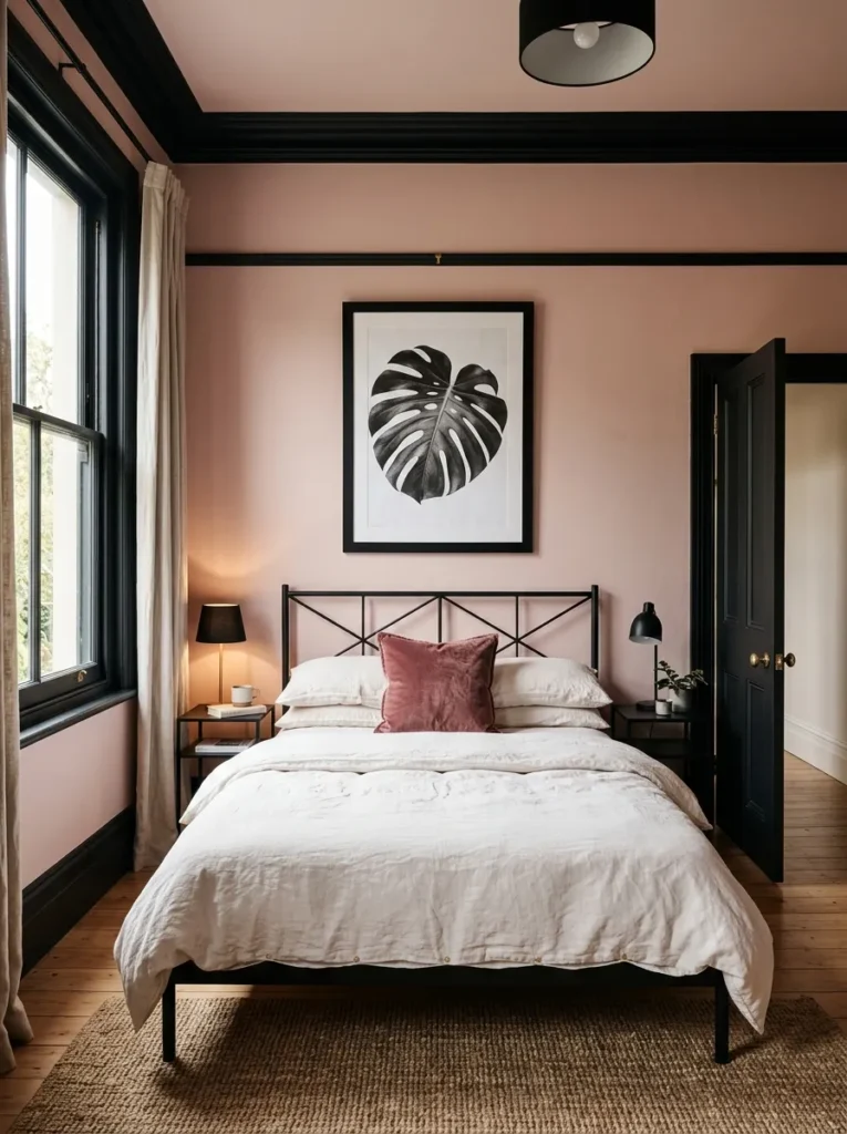
Vibe: The pink and black bedroom feels like a graphic decision that became a room — the strong architectural black against the warm dusty rose creating a precision and confidence that neither color achieves alone.
Why it works: Pink walls with black architectural detailing applies the graphic contrast luxury principle — the convention of painting wall surfaces and architectural elements (window frames, door frames, moldings) in the same color creates a visually unified but architecturally invisible room. Painting the architectural elements in matte black while keeping the walls in warm dusty rose creates a room whose architectural structure is suddenly visible and graphic, every window frame and molding profile precisely defined by the dark-light contrast. This architectural visibility communicates quality (the room’s architecture is precise enough to be highlighted rather than concealed) and creates the specific black-and-pink contrast palette that is one of the most bold and most resolved color combinations available in residential design.
Shop The Look
| Product |
|---|
| Warm dusty rose wall paint |
| Matte black architectural detail paint |
| Black frame iron bed headboard |
| Black shade lamp pair bedside |
| Matte black frame large print |
14. Blush Gallery Wall — Art-Led Pink
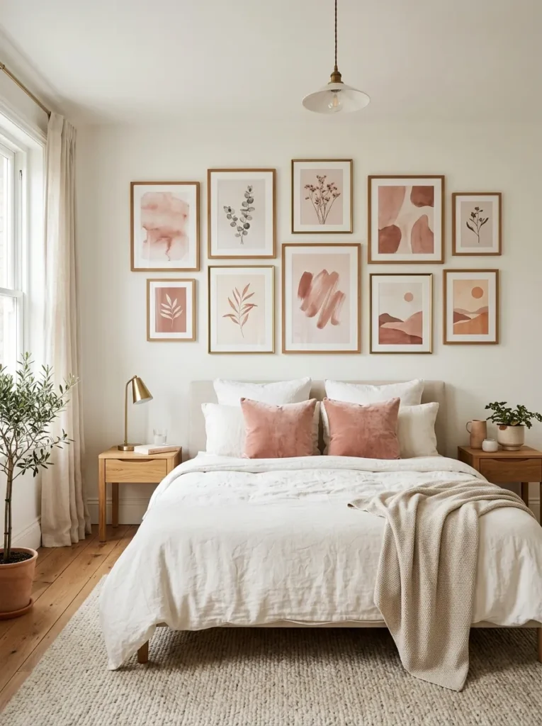
Vibe: The gallery wall pink bedroom feels like the room chose art as the vehicle for its color — the pink arriving through the art collection rather than through the walls creating a more nuanced and more personal color presence.
Why it works: A blush gallery wall in a white bedroom applies the art-as-color-source principle — rather than using wall paint to introduce pink into the bedroom, a gallery of art prints all drawn from the blush-dusty rose-warm cream palette creates the pink reference through accumulated art rather than architectural color. This approach produces a pink presence that reads as more personal (it is curated from specific artworks rather than selected from a paint chart) and more textural (the varied scales, frames, and subjects of the gallery provide visual complexity within the pink palette) than a painted wall. The warm white surrounding walls provide the neutral ground that allows each individual artwork to be read at its full color value, and the total gallery’s pink presence is read as a composed environment rather than a single color.
Gallery print sourcing: Blush, dusty rose, and warm cream abstract art prints are among the most widely available digital download art at accessible prices — independent artists on Etsy, Society6, and Creative Market produce the full range of blush abstract watercolor, botanical illustration, and gestural mark work at $8–25 per digital download for home printing at gallery quality.
Shop The Look
| Product |
|---|
| Blush abstract watercolor print set |
| Natural wood thin frame set 10 |
| Aged brass thin frame set 4 |
| White linen duvet and pillowcase |
| Blush velvet cushion pair |
15. Deep Fuchsia Accent — One Wall, Full Impact
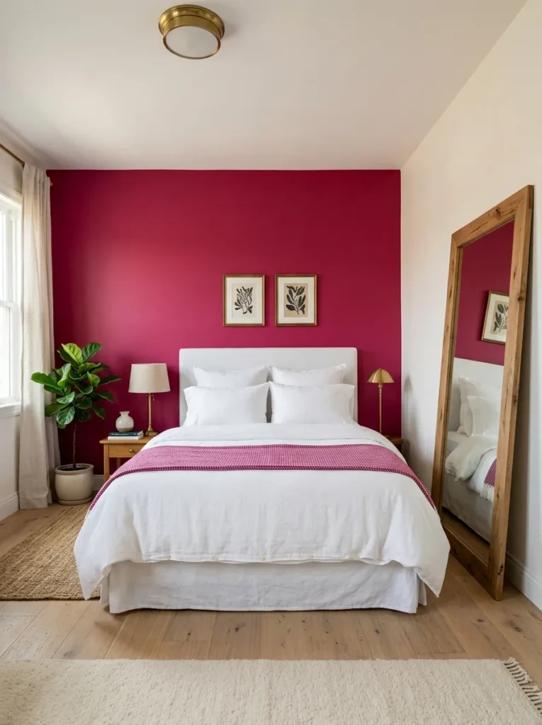
Vibe: The one-wall fuchsia bedroom feels like the room contained its boldest decision to its most appropriate surface and made that restraint the design — the single fuchsia wall creating impact through contrast rather than repetition.
Why it works: One deeply saturated fuchsia accent wall in an otherwise white bedroom applies the maximum impact from minimum application principle — the specific design intelligence of the single accent wall (as distinct from the all-pink room or the blush-everywhere approach) is that it uses the contrast between the fully saturated color and the white surrounding space to create an impact that neither could achieve alone. The white walls amplify the fuchsia’s saturation by providing the maximum chromatic contrast (white is the most complete contrast to any saturated color), and the fuchsia amplifies the white’s cleanliness by providing the maximum warm color reference that makes the white read as genuinely neutral rather than cool. The leaning mirror reflecting the fuchsia wall extends the color into the room’s visual field from a second angle without requiring a second pink surface.
Color specification: Deep fuchsia for this application must have sufficient red-warmth to prevent it reading as fluorescent or neon — specify a warm base (not a cool blue base) and a maximum saturation at medium-to-dark value (not a light pastel and not the brightest possible saturation). Farrow & Ball’s Confetti, Little Greene’s Carmine, or Dulux’s Deep Cerise are examples of the warm fuchsia specification that produces this effect.
Shop The Look
| Product |
|---|
| Deep warm fuchsia matte accent paint |
| Warm white complementary wall paint |
| White linen duvet and pillowcase set |
| Aged brass lamp and hardware set |
| Large natural wood leaning mirror |
How to Start Your Luxury Pink Bedroom
The single most important first move in a luxury pink bedroom project is identifying the specific pink undertone that will coordinate with the existing or intended materials before purchasing any paint or fabric. Pink exists across a wide spectrum of undertones — yellow-warm (dusty blush, terracotta pink, rose-gold), neutral (clean rose, mid-pink), and blue-cool (mauve, raspberry, fuchsia) — and each undertone family coordinates with a different set of companion materials. Yellow-warm pinks (ideas 1, 6, 7, 10) coordinate with aged brass, natural wood, raw ceramic, and dried botanical. Neutral pinks (ideas 2, 3, 12) coordinate with warm marble, warm walnut, and cream linen. Blue-cool pinks (ideas 5, 11, 15) coordinate with antique brass, deep jewel greens, and rich velvets. Identifying the undertone by holding a sample against a warm white and a cool white (the warm undertone sample appears warmer against cool white and relatively neutral against warm white) prevents the most common pink bedroom mistake: a pink that conflicts with its metallic or textile companions because its undertone was not identified before commitment.
The most common mistake in pink bedroom design is choosing a pink at the wrong value — either too pale (producing a pink that reads as unpainted rather than deliberately blush) or too saturated (producing a pink that overwhelms the room’s other materials before they can contribute to the composition). The most reliable value range for a primary pink wall color is mid-pale to mid-value — pale enough to remain a background rather than a foreground, but saturated enough to read as a deliberate color decision rather than an accidental warmth. Testing three paint samples at the intended wall color position (not on a small sample card but at minimum 30×30cm on the actual wall) in morning light, midday light, and evening lamp light reveals how the pink’s value shifts across the day’s light conditions and whether it reads as deliberately pink in all three conditions.
Three specific investments under $100 that immediately create a luxurious pink bedroom atmosphere: a pair of dusty rose or blush velvet cushion covers in the 50cm square format ($25–45 for two quality velvet covers, providing the jewel-tone tactile and visual richness that converts any neutral bedroom toward the pink palette); a set of two warm 2700K bulbs for existing bedside lamps ($10–20, replacing cool or daylight bulbs and immediately warming the pink tones of any existing pink or blush surface in the room); and a dusty rose linen pillowcase pair ($20–40, providing the highest-contact surface of the bed — the pillowcase — in the pink material that most immediately shifts the bed’s chromatic identity). These three investments combined for under $80 introduce velvet richness, warm light calibration, and linen pink texture simultaneously, addressing three of the key luxury pink bedroom dimensions.
Frequently Asked Questions About Luxury Pink Bedrooms
What is the difference between pink that reads as luxurious and pink that reads as juvenile?
The distinction between luxurious pink and juvenile pink is almost entirely a function of value (lightness or darkness) and saturation combined with material context. Juvenile pink is typically high-saturation, mid-to-light value, and surrounded by equally bright materials (white gloss furniture, synthetic textiles, high-contrast accents) — the pink of a child’s bedroom set or a commercial Valentine’s Day display. Luxurious pink is lower in saturation (dusty, muted, slightly gray or earthy), deeper in value (not a pastel but a mid-value to dark pink), and surrounded by quality natural materials (velvet, linen, natural stone, aged brass, dark wood) that provide the material authority the pink itself lacks in isolation. The specific material companions are as important as the pink itself — a deep rose velvet in a room of dark walnut and aged brass reads as unmistakably luxurious; the same deep rose velvet in a room of white gloss furniture reads as a child’s bedroom color in adult furniture.
Which metallic finish works best with pink?
The metallic finish that works best with any specific pink depends entirely on the pink’s undertone. Aged or antique brass (warm yellow-gold patina) coordinates with warm-undertone pinks — dusty blush, terracotta pink, rose-gold, and warm rose. Antique gold (warmer and darker than aged brass, with a slightly orange warmth) coordinates with deep warm pinks — raspberry, deep rose velvet. Matte black coordinates with any pink value by providing graphic contrast rather than chromatic coordination — it works specifically well with dusty rose and pale blush because the high contrast reveals the pink’s warmth against the black’s coolness. Brushed nickel or chrome (cool silver) is the metallic most commonly problematic with pink — the blue-cool undertone of nickel conflicts with the yellow-warm undertone of most pinks, creating a chromatic tension that reads as mismatch rather than contrast.
How do you make a pink bedroom look sophisticated rather than themed?
A pink bedroom reads as sophisticated rather than themed when pink is treated as a material color rather than a decorative theme. Material color means: the pink is present in the room’s primary surfaces (wall paint, upholstery, or major textiles) rather than in its decorative objects (pink picture frames, pink accessories, pink ornaments). A room where the walls are dusty rose, the headboard is deep rose velvet, and the curtains are warm pink linen — with all accessories in aged brass, natural wood, and cream — reads as a room in a considered pink palette. A room where the walls are white but pink appears in a pink picture frame, pink ceramic rabbits, a pink mirror, and a pink scatter cushion reads as a pink-themed room — the distinction being that the former uses pink in the room’s spatial-architectural elements and the latter uses pink in its decorative objects.
Can pink work in a bedroom shared by people with different aesthetic preferences?
Pink can work in a shared bedroom when it is used in the specific material register that reads as warm neutral rather than obviously pink — dusty blush, warm terracotta-pink, and warm bare plaster tones are the pink family members most consistently described as acceptable by people who do not consider themselves pink enthusiasts, because these colors read as warm cream or warm earth tones in some light conditions and reveal their pink only in specific light qualities. The framing also matters — a shared bedroom designed with “warm, natural material palette” as its brief rather than “pink bedroom” as its brief, but implementing dusty blush, natural linen, and aged brass as the primary material family, typically achieves the visual result of a warm pink bedroom without triggering the resistance that the explicit category might produce.
What are the best companion colors for pink in a bedroom?
The companion colors that most consistently produce a luxurious result with pink in a bedroom depend on the specific pink: deep forest green (Ideas 5 and the broader botanical palette) provides the warm complementary contrast that makes both colors appear more vivid; warm cream or oat linen provides the warm neutral that allows pink to read at its full color value without competing; deep warm burgundy or wine creates an analogous combination within the warm red-pink family; warm walnut or dark wood provides the value contrast that grounds the pink in material weight; and warm white provides the clean maximum contrast that allows deeply saturated pinks to be read at their most precise. The colors that most consistently conflict with pink are cool gray (which makes warm pinks appear orange against the cool reference), cool white (which makes any pink appear slightly pink-orange), and strong blue or teal (which creates a chromatic tension that requires very precise undertone management to resolve).
Ready to Design Your Luxury Pink Bedroom?
These 15 designs move through the full spectrum of what luxury pink can be — from the barely-there confidence of dusty blush linen walls that reveal their pink only in morning light, through the material conversation between warm marble veining and rose wall paint, the graphic authority of deep rose velvet against an oversized headboard, the jewel-box drama of raspberry beside forest green, and the organic authenticity of bare plaster with a warmth that comes from the plaster itself rather than from any added pigment. Starting with the undertone identification — the 30-second test of holding a paint or fabric sample against warm white and cool white to determine whether the pink leans warm or cool — is the beginning that makes every subsequent material companion decision a coordination rather than a guess. Identify the undertone, pull the companion materials that share that undertone family, order the paint samples at the 30×30cm scale, and assess them on the actual wall in the actual room at morning, midday, and evening light. When the samples reveal which pink belongs in this specific room with this specific light and these specific materials — order the full quantity with confidence and begin the room that has been waiting for the right decision about its color.