14 Elegant Navy Bedroom Ideas for Every Style
Elegant navy bedroom ideas for every style use the specific chromatic and atmospheric qualities of deep navy — its capacity for creating enclosure and intimacy, its compatibility with warm metallics and natural materials, its simultaneous reference to maritime, classical, and contemporary design traditions, and its specific quality in lamp light of appearing to glow rather than simply absorb — to create bedrooms that feel simultaneously considered and restful, richly colored and visually calm. This article gives you exactly 14 ideas spanning full-room navy immersion, feature wall applications, navy textile approaches, furniture selections, and the specific companion material and color decisions that distinguish an elegant navy bedroom from one that reads as cold or heavy.
A navy bedroom done well is not a dark bedroom — it is a warm one. The specific quality that distinguishes elegant navy from oppressive navy is entirely in the companion material choices, the light sources, and the proportion of navy to warm neutral that the room achieves. Here are 14 ideas worth considering.
Why Elegant Navy Bedroom Ideas Work for Every Style
Navy — the specific dark blue that sits between royal blue and near-black, with sufficient blue saturation to read unambiguously as a blue family color while carrying the depth and visual weight of a near-neutral — is the bedroom color with the broadest documented cross-demographic appeal in interior design research. A 2013 study by Travelodge involving 2,000 British homes found that people with blue bedrooms averaged the highest sleep duration and best sleep quality of any color group, attributing the effect to blue’s documented lowering of heart rate and blood pressure in response to the color’s strong association with calming sky and water environments. Navy specifically — the deepest, most saturated end of the blue family — produces this effect more powerfully than pale or mid blues because its darkness creates the psychological enclosure that the sleep environment benefits from, its warmth undertone (true navy has a slight red-warm undertone that prevents it from reading as cold) maintains the room’s material warmth, and its depth makes it the bedroom color that most powerfully catches and warms the quality of lamp light.
The design versatility of navy is demonstrated by its appearance across radically different interior styles: the crisp navy and white of coastal New England design, the navy and gold of classic European interior design, the navy and natural timber of contemporary Scandinavian design, the navy and blush of contemporary romantic interior design, and the navy and deep green of maximalist botanical design. This versatility makes navy the bedroom color with the widest range of aesthetic compatibility — almost any design direction can be expressed through a navy bedroom with the right companion colors and materials.
Style at a Glance
| Element | Navy Function | Elegant Design Edge |
|---|---|---|
| Philosophy | Navy creates enclosure, warmth, and color depth | The companion materials determine the style |
| Undertone | Warm navy (slight red undertone) for warm rooms | Cool navy (slight green undertone) for contemporary crisp |
| Key Companions | Warm white, aged brass, natural linen, warm timber |
14 Elegant Navy Bedroom Ideas for Every Style
1. All-Navy Immersion — The Enveloping Dark Room
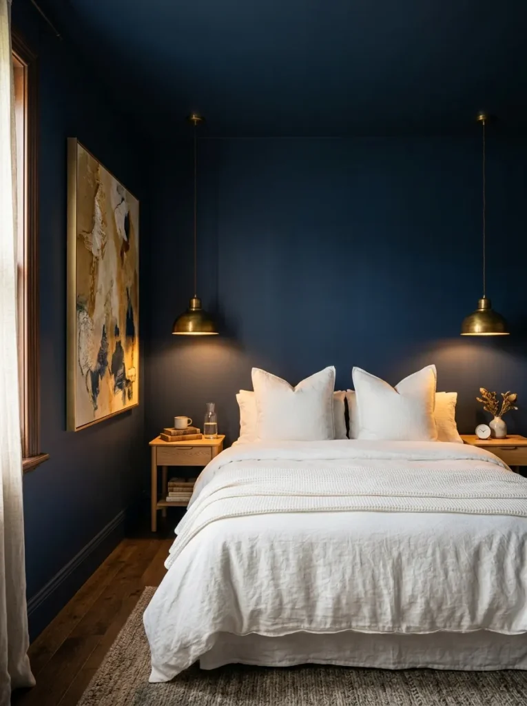
Vibe: The all-navy room feels like sleeping inside a warm ocean depth — the complete chromatic enclosure of all four walls and the ceiling creating the specific intimacy that no feature wall application can achieve.
Why it works: All four walls and ceiling in the same deep warm navy apply the chromatic immersion principle — when all surfaces share the same deep color, the room reads as a created environment rather than a decorated space. The ceiling extending the navy upward (at a slightly deeper shade that prevents the room from feeling as though the ceiling is falling) amplifies the cave-like enclosure that creates the room’s specific atmospheric quality. The crisp warm white bed provides the maximum contrast that makes the navy appear at its deepest and most saturated — white in a navy room appears crisply white rather than slightly off-white, and the navy appears more richly colored than it would against a lighter background.
Paint specification: Navy undertone is critical for an all-navy room. Specify a navy with a clear warm (red-purple) undertone rather than a cool (green) undertone — warm navy reads as cosy and enveloping in lamp light; cool navy can read as gray or slightly clinical. Test three or four navy candidates at 30×30cm on the actual wall in the morning and evening light before committing to a full room. Recommended: Farrow & Ball Hague Blue, Little Greene Hicks’ Navy, Benjamin Moore Hale Navy.
Quick Win: If painting all four walls and the ceiling in one weekend feels daunting, begin with three walls and the ceiling only, leaving the wall behind the headboard as a temporary warm white for the first month. The three-wall version immediately creates most of the immersive quality at lower initial commitment.
Shop The Look
| Product |
|---|
| Deep warm navy matte paint |
| Warm white linen duvet cover |
| Aged brass pendant bedside pair |
| Natural oak bedside table |
| Abstract artwork warm gold cream |
Also view: 15 Beautiful Spring Home Decor Ideas
2. Navy Feature Wall with Warm White — The Classic Contrast
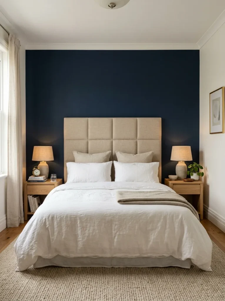
Vibe: The navy feature wall feels like the bedroom found its direction — the single dark wall organizing the bed composition against it and creating the depth that three neutral walls alone cannot provide.
Why it works: A navy feature wall on the headboard wall applies the focal anchor principle — a single dark wall behind the bed creates a visual anchor that organizes the bed composition against it, making the bed appear more centered, the headboard more substantial, and the bedding more beautifully white by contrast. The warm white on the three remaining walls prevents the room from reading as heavy or dark (the navy occupies only 25% of the room’s total wall area in a feature wall application) while providing sufficient visual warmth to prevent the room from reading as cold or clinical.
Proportion rule: The navy feature wall should extend to floor and ceiling and should be wide enough to provide a continuous dark field behind the bed on each side — a minimum of 30cm beyond the bed’s outer edges on each side creates the anchored quality; a narrower navy section reads as a painted accent rather than a designed feature wall.
Shop The Look
| Product |
|---|
| Deep navy matte feature wall paint |
| Warm white complementary paint |
| Oat linen upholstered headboard |
| Warm white linen duvet cover |
| Ceramic bedside lamp warm shade |
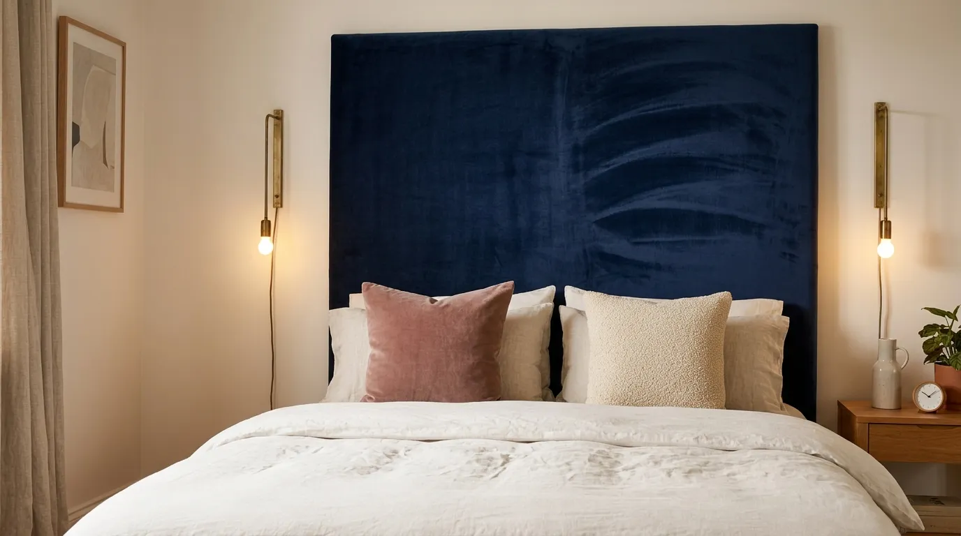
3. Navy Velvet Headboard — Statement Without Commitment
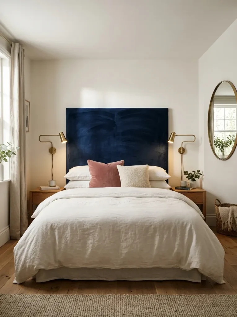
Vibe: The navy velvet headboard feels like the bedroom made one decisive color statement and let everything else serve it — the deep navy velvet against the warm white wall creating the maximum chromatic impact from a single furniture decision.
Why it works: A large navy velvet headboard on a warm white wall applies the statement furniture principle — the headboard is the bedroom’s most prominent single furnishing element, and its color and material choice creates the room’s primary design statement more directly than any wall paint decision (because the headboard can be replaced, while the wall requires repainting). Navy velvet is the headboard specification that produces the richest combination of color depth and material quality — the velvet’s pile catches the lamp light differently at every angle, creating a surface that appears to shift between near-black and rich navy as the viewing angle changes.
Companion cushion pairing: The dusty rose velvet cushion and the cream boucle cushion provide the ideal companion colors for a navy velvet headboard: dusty rose sits at the warm-pink end of the spectrum that directly complements navy’s warm-blue depth (complementary colors, both in the warm register), and cream boucle provides the neutral texture that softens the transition between the navy and the white bedding.
Shop The Look
| Product |
|---|
| Navy velvet upholstery fabric |
| Arched or rectangular headboard frame |
| Aged brass wall reading light pair |
| Dusty rose velvet cushion cover |
| Thin brass round mirror |
4. Navy and Warm Brass — The Classic Metallic Pairing
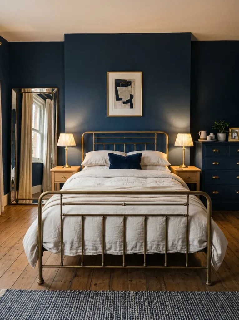
Vibe: The navy and brass bedroom feels like a room that studied the history of European luxury interiors and distilled them to two materials — the deep navy and the warm brass creating a two-material system of genuine chromatic authority.
Why it works: Navy walls with consistent warm brass hardware throughout applies the two-material luxury principle — when a room uses only two primary materials and uses them with complete consistency (all metallic elements in one warm brass finish, all wall surfaces in one deep navy color), the room reads as a designed system rather than an assembled collection of objects. The specific success of the navy-and-brass pairing rests on the warm undertone relationship between the two materials: warm navy (with its slight red-purple warmth) and aged brass (with its warm gold-brown warmth) share a warm color temperature that creates a chromatic conversation — the navy amplifies the brass’s warmth, and the brass amplifies the navy’s depth.
Brass consistency: As discussed in the timeless neutral bathroom article, achieving the luxury of the two-material system requires complete consistency of the brass finish across every metallic element in the room — bed frame, lamps, mirror frame, drawer pulls, curtain rod, and even the light switch plates. Mixing aged brass with satin brass or polished brass destroys the material system’s coherence.
Shop The Look
| Product |
|---|
| Brass bed frame horizontal headboard |
| Aged brass table lamp pair |
| Cream lamp shade pair |
| Large brass-framed leaning mirror |
| Navy dresser with brass pulls |
5. Navy and Natural Linen — The Coastal Contemporary
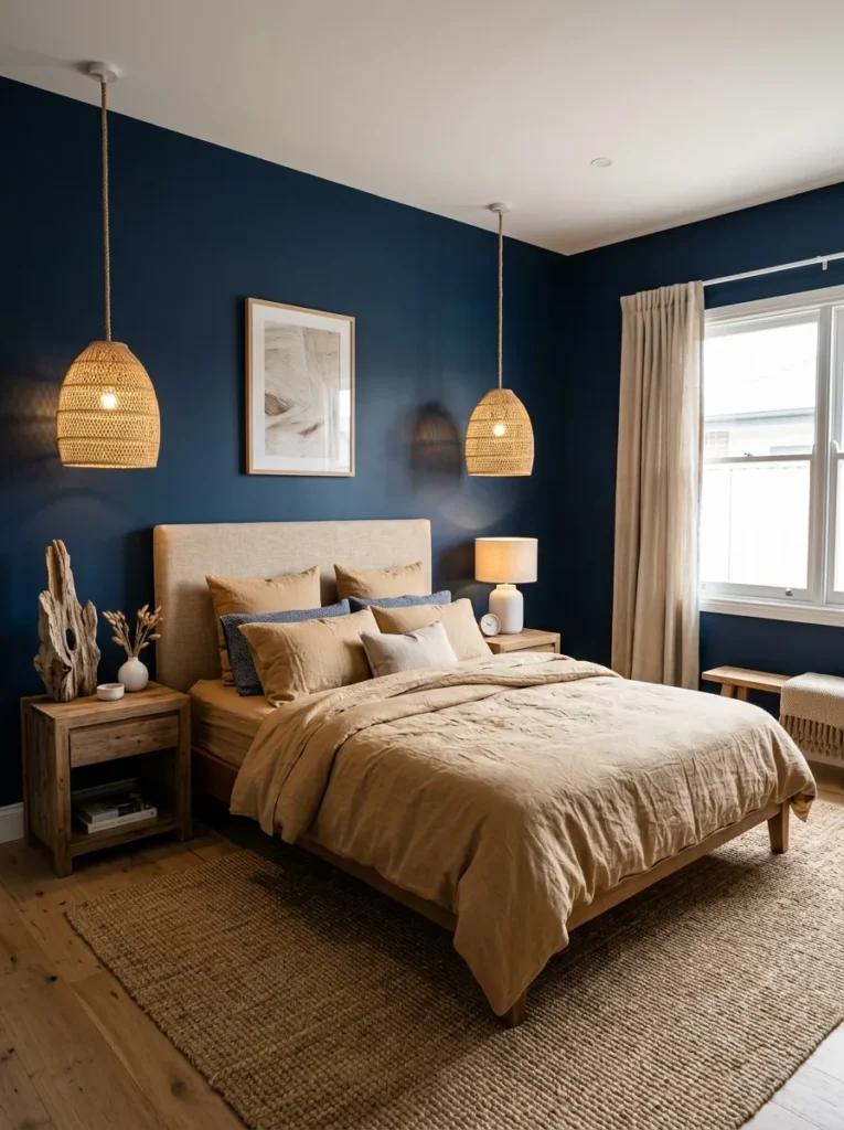
Vibe: The navy and natural linen bedroom feels like a room that references the sea without a single anchor or wheel in it — the deep navy walls and the warm natural linen creating the maritime color pairing through pure material and color quality.
Why it works: Navy walls with warm natural linen bedding and natural fiber accents applies the coastal reference through material palette principle — the most effective coastal bedroom references the sea’s color vocabulary (navy, natural linen, rope, timber, white ceramic) without the literal maritime iconography (anchors, wheels, lighthouse illustrations) that dates quickly. The natural fiber elements (jute rug, rope or rattan pendants, driftwood) create the textural warmth of genuinely natural materials that reference the coastal environment through their material qualities rather than through their symbolic associations.
The warm oat linen choice: White linen against navy is dramatically beautiful (maximum contrast), but warm oat natural linen against navy is more cohesive and more lived-in — the oat’s slight warmth bridges the temperature gap between the cool navy and the warm natural fiber elements, creating a more unified material composition.
Shop The Look
| Product |
|---|
| Warm oat washed linen duvet cover |
| Oat linen upholstered headboard |
| Natural rope pendant pair |
| Natural jute rug large |
| White ceramic table lamp |
6. Navy and Warm Timber — The Scandi-Influenced Bedroom
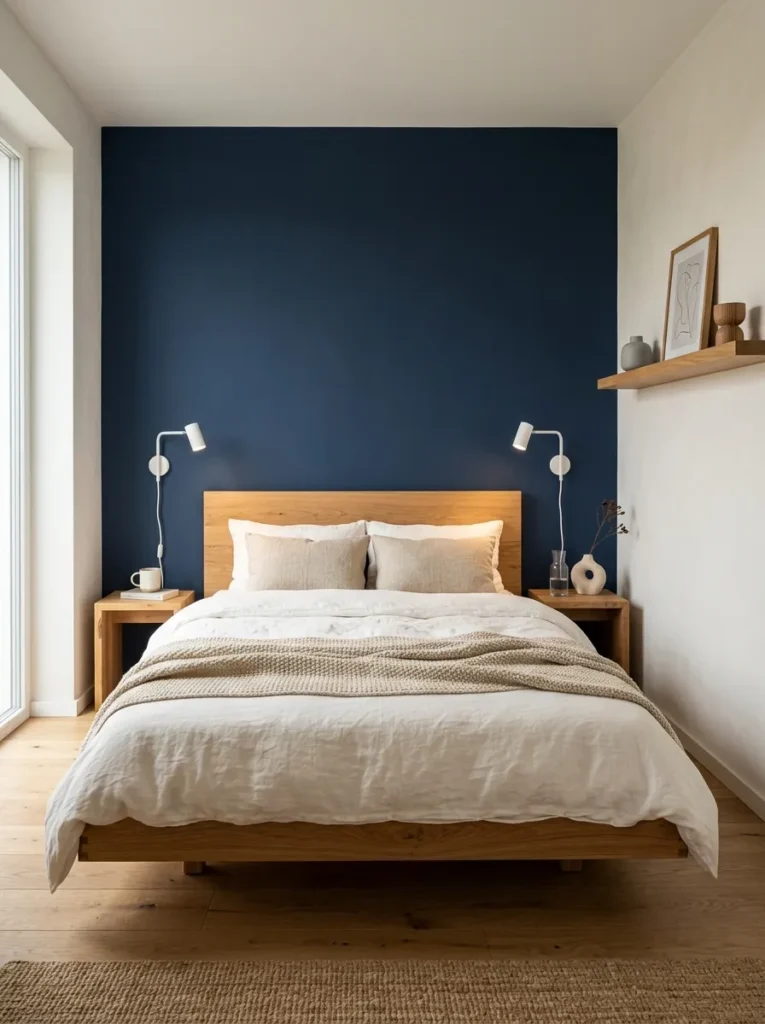
Vibe: The navy and warm timber bedroom feels like a room that understood the Scandinavian principle that two carefully chosen materials are richer than six loosely chosen ones — the navy and the warm oak creating a complete room through the quality of their relationship.
Why it works: A navy feature wall with warm natural timber furniture applies the Scandinavian material discipline principle — the Scandinavian interior design tradition’s specific contribution to bedroom design is the understanding that warmth is created by material quality and material relationship rather than by decorative addition. A navy wall with warm oak furniture, warm white linen, and a single natural linen textured throw creates a room of genuine warmth and resolve through three materials used with complete intention. No decorative objects, no pattern, no complexity beyond the quality of each material — the room’s richness is entirely in the navy’s depth against the oak’s honey warmth.
Timber specification: The timber should be warm-toned and natural-finished (natural oil or hard-wax oil, not varnish) — this warm, matte finish reads as Scandinavian rather than commercial. Light oak (Scandinavian whitened oak) or warm natural walnut are the most appropriate timber specifications for the navy-and-timber pairing.
Shop The Look
| Product |
|---|
| Natural oak low platform bed |
| Navy matte feature wall paint |
| Warm white linen bedding set |
| Solid oak bedside table pair |
| Natural linen textured throw |
7. Navy and Deep Forest Green — The Jewel Box Bedroom
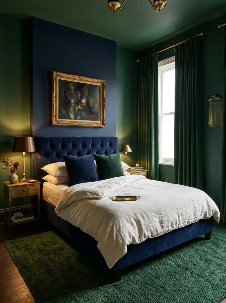
Vibe: The navy and forest green bedroom feels like a room that had the confidence to put two deep colors together and discovered they made each other better — the navy and the forest green creating a chromatic richness that neither color achieves in a neutral room.
Why it works: Navy and deep forest green in the same bedroom apply the analogous jewel color principle — navy and forest green sit in an analogous color relationship (adjacent on the color wheel, both in the blue-green range), meaning they share the same cool-warm undertone character while being clearly different hues. This analogous relationship creates the specific quality of chromatic richness without chromatic conflict — the colors enhance each other’s depth rather than competing for visual dominance. The warm white linen bed and the aged brass hardware provide the neutral-and-warm anchors that prevent the two-deep-color room from reading as overwhelmingly dark.
Color proportion: The navy and forest green should be in approximately equal proportion for the mutual amplification effect to work — one color significantly dominant over the other reduces the rich jewel-box quality to a decorated room with one primary color and one accent.
Shop The Look
| Product |
|---|
| Deep forest green wall paint |
| Deep navy wall paint |
| Navy velvet bed frame |
| Forest green wool rug large |
| Forest green velvet curtain pair |
8. Navy and Warm Blush — The Romantic Contrast
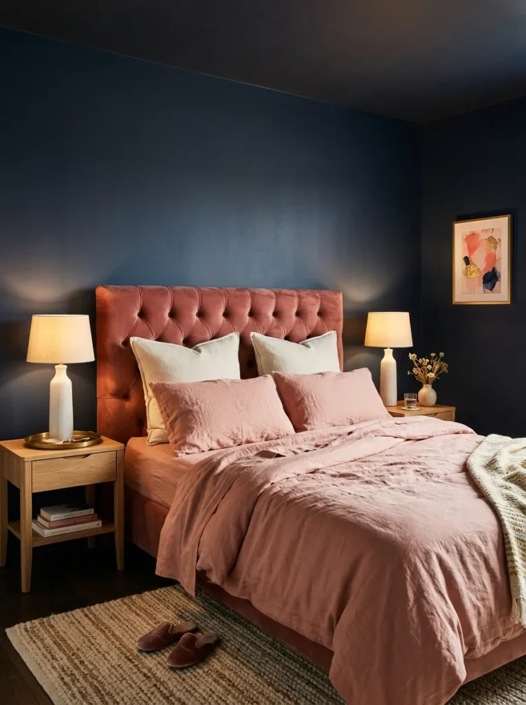
Vibe: The navy and blush bedroom feels like the most romantic possible version of a dark room — the warm blush linen and the navy walls together creating a complementary color relationship of genuine visual warmth.
Why it works: Deep navy walls with warm blush bedding and upholstery apply the warm complementary contrast principle — warm blush-pink (a pink with yellow-orange warmth, not blue-cool pink) sits at the warm-pink end of the color spectrum that most directly complements navy’s warm-blue depth. The complementary relationship (warm blue and warm pink-red are opposite families on the warm color wheel) creates mutual intensification: the navy appears richer against the blush, and the blush appears more warmly vivid against the navy. This contrast is the most specifically romantic of all navy companion color choices because of the warmth of the pink register and its specific associations with warmth, softness, and emotional intimacy.
Undertone alignment: For the navy-and-blush pairing to read as warm and cohesive rather than conflicting, both colors must have the same warm undertone — navy with a slight red-warm undertone and blush with a yellow-warm undertone (not a blue-cool undertone, which would clash with the navy’s warm blue). Test the two paint or fabric samples against each other in the room’s actual light before purchasing.
Shop The Look
| Product |
|---|
| Warm blush linen bedding set |
| Blush velvet headboard upholstery |
| Warm white euro square pillowcase |
| Ceramic lamp base warm white |
| Blush or cream shade pair |
9. Navy Curtains — The Textile Route to Navy
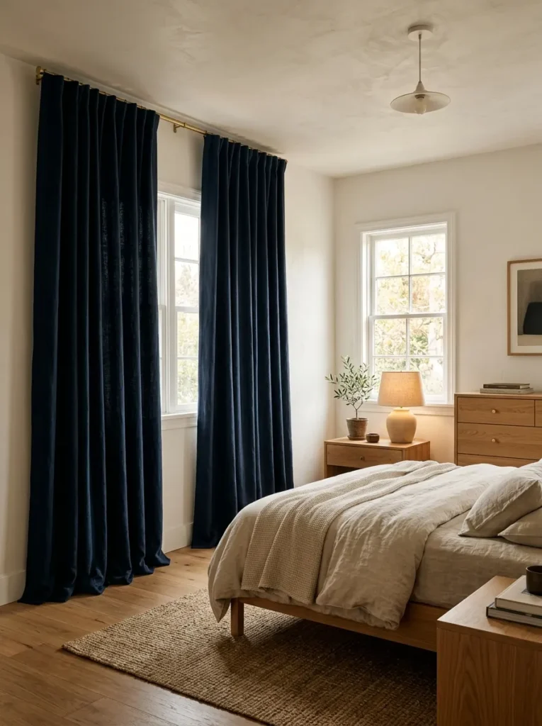
Vibe: The navy curtain bedroom feels like a room that achieved its depth at the window rather than on the walls — the deep navy fabric panels creating the room’s entire dark-color presence in a single window treatment decision.
Why it works: Deep navy ceiling-height curtains in an otherwise neutral bedroom apply the textile color introduction principle — for renters, for households reluctant to commit to painting, or for rooms where the existing architecture makes wall painting impractical, navy curtains provide the depth, warmth, and color presence of navy walls through a textile application that is entirely reversible. Ceiling-height curtains (hung from a rod within 5cm of the ceiling, extended 35cm beyond the window on each side) provide the vertical dimension and the quantity of navy fabric needed to create the room’s primary color statement — a curtain panel that is correctly proportioned reads as an architectural element rather than a fabric accessory.
Fabric specification: For a bedroom, deep navy linen provides the warmth of natural fiber with the matte light absorption that enhances the navy’s depth. Navy velvet provides even more dramatic depth (the pile creates the directional light quality described in the headboard idea) but is a heavier and more formal material choice. Specify interlining (a layer of thermal fabric between the curtain fabric and the lining) for all bedroom navy curtains — the interlining adds warmth, weight, and the beautiful drape of a professionally made curtain.
Shop The Look
| Product |
|---|
| Deep navy linen curtain pair |
| Navy velvet curtain alternative |
| Ceiling-height curtain rod brass |
| Curtain interlining lining set |
| Curtain ring brass clip set |
10. Navy Painted Furniture — The Piece-by-Piece Approach
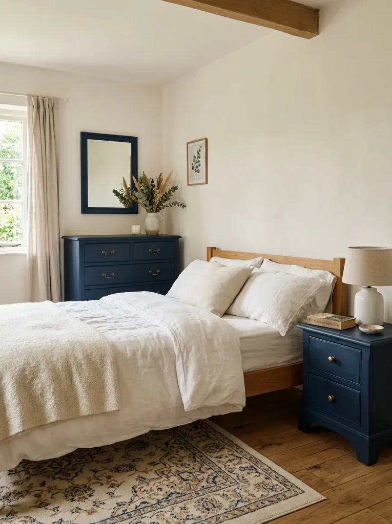
Vibe: The navy painted furniture bedroom feels like a room that invested in transformation rather than replacement — the painted furniture pieces providing the room’s color depth through a skill-based intervention rather than a purchasing decision.
Why it works: Navy-painted furniture in a neutral room applies the color-through-furniture principle — painting existing bedroom furniture (a chest of drawers, bedside tables, a wardrobe) in deep navy is the highest-return single intervention for introducing navy into a bedroom without painting walls, particularly valuable for rented rooms and for households with existing furniture of good structural quality that no longer reads as fashionable in its original finish. A navy-painted chest of drawers in a warm white bedroom creates the room’s entire dark-color presence through a single piece, and the correct hardware choice (warm brass drawer pulls) converts the painted furniture from a cost-saving measure into a considered design statement.
Painting specification: Clean and sand the furniture surface before painting (80 grit for removing gloss, 120 grit for smoothing). Prime with a bonding primer compatible with the existing surface material. Apply two coats of furniture-specific navy paint in satin or eggshell finish (furniture paint must be more durable than wall paint — specify a furniture-specific formulation such as Frenchic, Annie Sloan Chalk Paint sealed with wax, or Rust-Oleum Chalk Paint). Allow full cure time (minimum seven days) before using the furniture.
Shop The Look
| Product |
|---|
| Navy furniture paint satin finish |
| Bonding primer furniture base |
| Warm brass drawer pull set |
| Furniture wax or sealer |
| Small navy frame mirror |
11. Navy and Warm Terracotta — The Unexpected Pairing
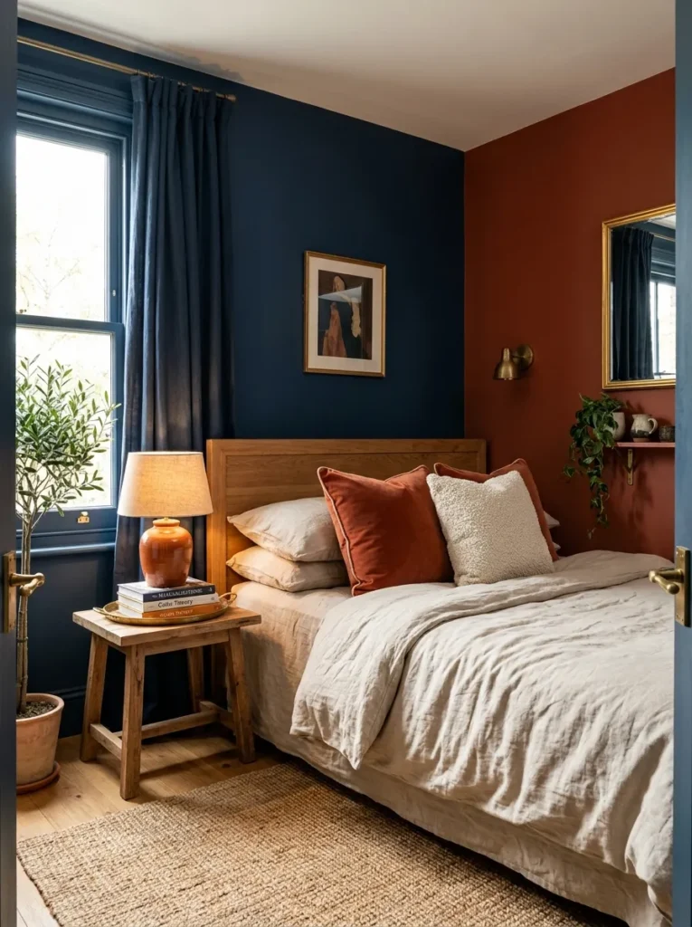
Vibe: The navy and terracotta bedroom feels like the most confident possible color pairing in a bedroom — two deep, saturated, warm colors meeting at a corner with the confidence of a room that knows the pairing works.
Why it works: Navy and warm terracotta in the same bedroom apply the warm split-complementary color principle — navy (warm blue) and terracotta (warm orange-earth) sit in a warm split-complementary color relationship: warm terracotta contains the warm orange that is opposite blue on the color wheel, creating the mutual intensification of complementary colors. The warmth of both colors (warm navy rather than cool blue, warm terracotta rather than cool orange) creates the cohesion that prevents the pairing from feeling garish — both colors share the same warm color temperature, making their combination feel considered rather than accidental.
Application proportion: The three-walls-navy and one-wall-terracotta proportion (rather than two-and-two) prevents the room from reading as divided between two competing colors — the navy is clearly the dominant color and the terracotta is clearly the accent, while the terracotta’s depth (not a pale accent color but a genuinely saturated mid-value terracotta) gives it sufficient visual weight to read as a designed companion rather than a subordinate accent.
Shop The Look
| Product |
|---|
| Warm terracotta matte wall paint |
| Deep navy matte wall paint |
| Terracotta velvet cushion cover |
| Natural jute rug bedroom |
| Terracotta glaze ceramic lamp base |
12. Navy Grasscloth Wallpaper — The Textured Alternative
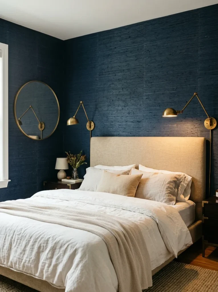
Vibe: The navy grasscloth bedroom feels like a wall that earned its texture — the natural fiber of the grasscloth creating a navy surface whose material depth exceeds what any paint finish can achieve.
Why it works: Navy grasscloth wallpaper applied to the headboard wall applies the material depth principle — grasscloth wallcovering (woven natural fiber — seagrass, sisal, or abaca — adhered to a paper backing and dyed) creates a wall surface whose color has genuine material depth: the navy color exists within natural fiber that has its own dimensional quality, creating subtle variation in tone and texture across the surface as the fiber absorbs and reflects dye at different rates. This material variation creates the visual richness of a genuinely natural material at a scale and intensity that no flat paint can replicate. In navy, the grasscloth’s natural fiber texture is particularly effective because the dark saturated color shows the fiber’s dimensional quality most clearly in directional light.
Grasscloth specification: Genuine grasscloth is available from specialist wallcovering suppliers and provides the most authentic material quality. Navy-dyed grasscloth is available from high-quality wallcovering brands including Phillip Jeffries, Elitis, and Schumacher. Seam management is critical in any grasscloth installation — the natural fiber creates visible seams that must be planned to align with architectural features (window and door frames) rather than appearing in the middle of a wall surface.
Shop The Look
| Product |
|---|
| Navy grasscloth wallpaper natural |
| Wallpaper paste grasscloth |
| Cream or oat upholstered headboard |
| Aged brass wall light pair |
| Thin brass round mirror |
13. Navy and Warm White Classic — The Timeless Application
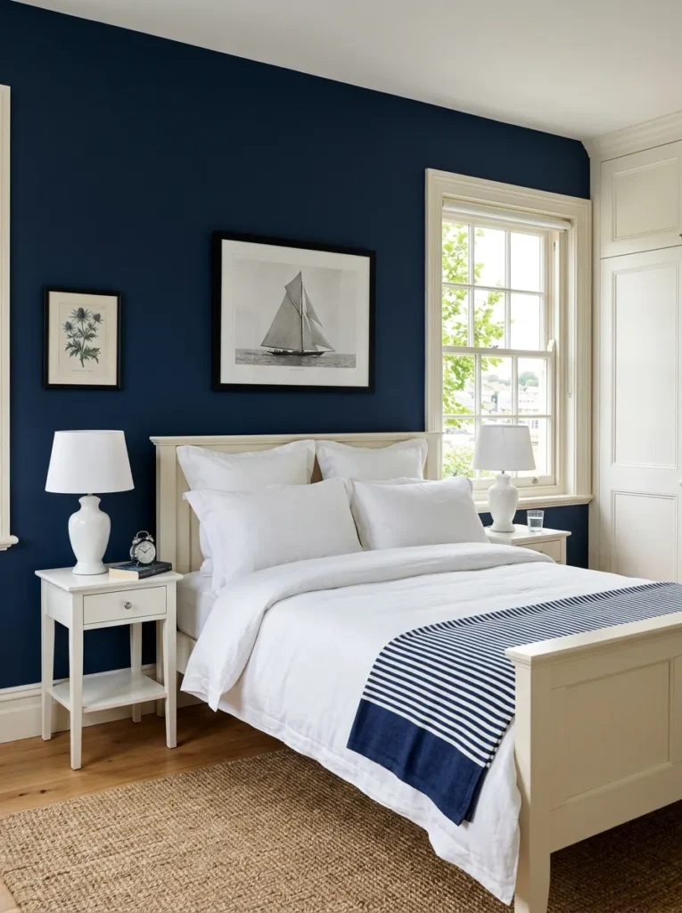
Vibe: The classic navy and white bedroom feels like a room in a New England shingled cottage or a southern hemisphere beach house — the navy and brilliant white creating the specific crisp, clean quality of maritime-referencing design at its most resolved.
Why it works: Navy walls with brilliant white woodwork applies the architectural contrast principle — the New England and coastal interior design tradition uses the high contrast between dark wall color and crisp white architectural elements (skirting, architrave, window frame, built-in panel edges) to create room definition through architecture rather than decoration. The white woodwork is the specific design element that most distinguishes this approach from a purely dark room — the white architrave, skirting, and window frame create a continuous white line that traces the room’s architectural structure against the dark wall field, making the room’s proportions and geometry clearly legible despite the dark wall color.
Paint specification: This application uses a mid-depth navy rather than the near-black navy of the immersive applications — the navy should read clearly as blue in bright natural light, with sufficient mid-value to allow the white woodwork’s contrast to be fully appreciated. Farrow & Ball Pitch Blue, Little Greene Azure Blue, or Benjamin Moore Slate Blue provide the correct mid-depth navy.
Shop The Look
| Product |
|---|
| Mid-depth navy matte paint |
| Brilliant white woodwork gloss |
| White painted or cream timber bed |
| Crisp white linen bedding |
| Navy white stripe accent textile |
14. Navy with Mixed Metallics — The Contemporary Maximalist
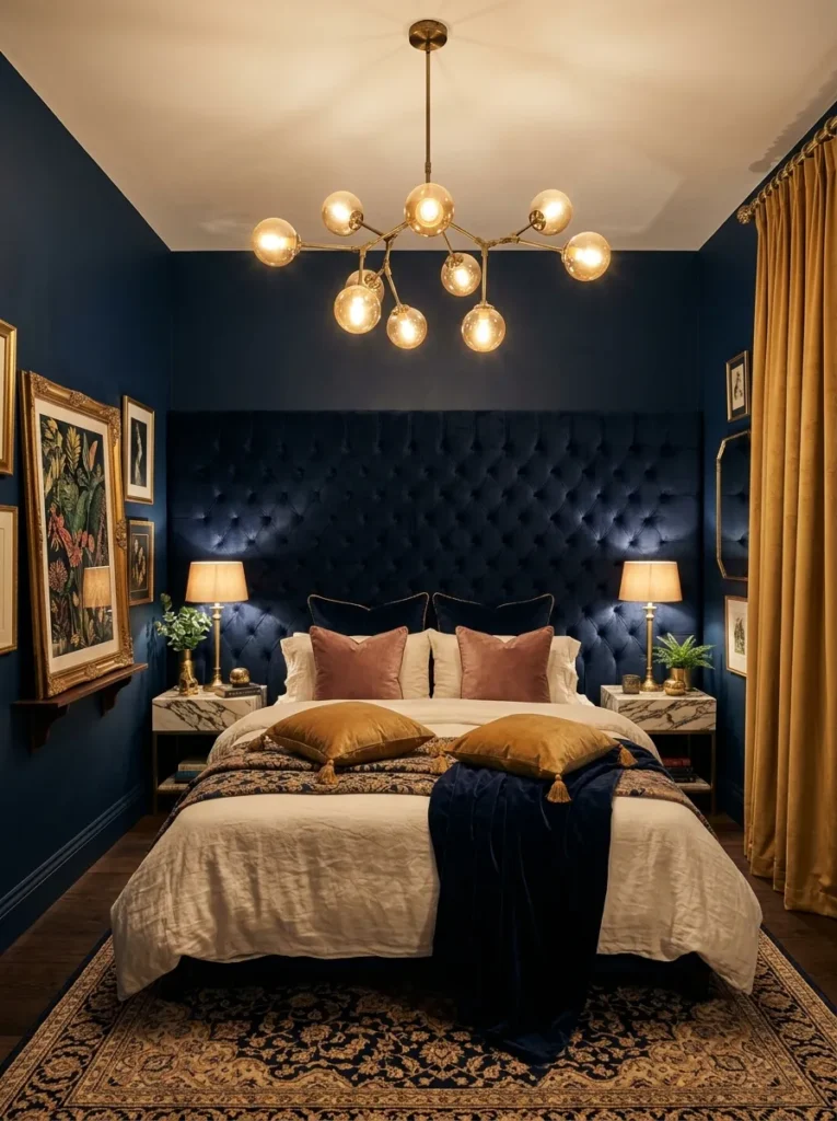
Vibe: The maximalist navy bedroom feels like a room that decided to be genuinely opulent and committed to it completely — the navy immersion, the warm gold velvet, the globe pendant, and the layered cushions creating a bedroom of genuine glamorous excess.
Why it works: A maximalist navy bedroom with layered warm metallics and rich textiles applies the contained maximalism principle — the maximalist bedroom achieves its richness through quantity and variety of elements within a completely consistent material and color system, rather than through a restricted palette applied minimally. The navy walls contain the maximalism — the rich variety of textures and warm metallic elements (the tufted headboard, the globe pendant, the velvet cushions, the gilded frame, the gold curtains) appear as a rich composition rather than as overwhelming visual noise because they all exist within the same deep navy field that provides the unified background against which the varied elements can be read as distinct contributions to a composed whole.
Maximalist discipline: The specific discipline that makes maximalist navy work rather than becoming overwhelming is the warm metallic thread — every element in this room shares the warm brass-gold metallic reference (aged brass pendant, brass table lamps, gold velvet, gilded frame). This consistent metallic presence provides the visual thread that unifies the varied elements without imposing a restrictive monochromatic palette.
Shop The Look
| Product |
|---|
| Large navy tufted headboard velvet |
| Aged brass globe pendant light |
| Gold velvet cushion cover |
| Gold velvet curtain ceiling height |
| Large gilded frame botanical print |
How to Start Your Navy Bedroom
The single most important first move before purchasing any navy paint, navy fabric, or navy furniture is testing three or four candidate navy colors on the actual bedroom wall at 30×30cm each, assessed at three different times: morning natural light, midday natural light, and evening lamp light. This assessment reveals the quality that most distinguishes successful from unsuccessful navy bedroom applications: the undertone behavior of the navy across different light conditions. A navy with a cool (green or gray) undertone reads as warm and sophisticated in the bedroom’s direct afternoon light, but can read as cold, slightly gray, or hospital-like in the warm lamp light of the evening bedroom. A navy with a warm (red-purple) undertone reads slightly brownish or grape-tinged in cool morning light but develops extraordinary depth and warmth in the amber lamp light of the evening — it is the evening lamp light performance that determines the bedroom’s atmospheric success, since the bedroom is used most intensively in the hours of lamp light rather than in the daylight hours.
The most common mistake in creating a navy bedroom is specifying a navy that is too cool in undertone for the companion materials being used. Cool-undertone navy (navy with a slight green-gray component) reads beautifully with cool-white, chrome, and cool stone companion materials but is significantly less successful with warm brass, warm timber, natural linen, and warm white — which are the companion materials most people instinctively choose. The warm-undertone navy (a navy with a perceptible slight red-purple warmth) is the specification that coordinates most broadly with the warm material palette and the warm lamp light that makes the bedroom most beautiful and most restful.
Three specific investments under $100 that most immediately improve the atmospheric quality of any navy bedroom: a set of warm 2700K LED bulbs for all existing bedroom lamps ($12–20 for a pack of six — warm lamp light is the single most important atmospheric variable in a navy bedroom, as it converts the navy from cool-dark to warm-deep with a bulb change); a warm oat or natural linen pillowcase set to replace any white or synthetic pillowcases ($25–45 for a quality linen pair — the natural linen against navy creates the material warmth that synthetic equivalents cannot); and one aged brass object (a candle holder, a small picture frame, a lamp, or a decorative object) placed in the room ($15–30 from a homeware retailer — the aged brass reference in a navy room provides the specific metallic warmth that activates the navy’s full atmospheric potential). These three investments combined for under $80 address light quality, textile warmth, and metallic accent — the three variables that most immediately determine a navy bedroom’s success.
Frequently Asked Questions About Elegant Navy Bedroom Ideas
Does navy make a bedroom feel smaller?
Navy makes a small bedroom feel more intimate, which is a different quality from feeling smaller. A pale color expands the apparent spatial dimensions of a room by making surfaces recede visually; a dark color like navy makes surfaces advance visually, reducing the apparent distance between walls. In a genuinely small room, this reduction in perceived space can read as slightly cramped if the room lacks natural light; in a room with adequate natural light, the same effect reads as cozy and intimate. The practical guides for using navy in a small bedroom: use it on fewer surfaces (a feature wall rather than all four walls), ensure the room has at least one large window that provides substantial natural daylight, and use appropriately scaled furniture (smaller-profile pieces that reveal more floor area).
What bedding looks best with navy walls?
The bedding colors that create the most beautiful results against navy walls depend on the design direction. For the classic crisp pairing: brilliant white linen (maximum contrast, clean, classic). For warmth and natural material beauty: warm oat or natural undyed linen (slightly lower contrast than white, significantly warmer). For romance: warm blush-pink linen or blush velvet cushions against warm white linen bedding. For contemporary luxury: charcoal or dark gray linen (tonal dark-on-dark with the navy, creating a deeply layered dark palette — this requires more warm metallic accents to prevent the room from feeling heavy). The specific combination that most consistently produces beautiful navy bedroom results across a wide range of design directions is: warm white linen duvet with euro squares, one warm-colored velvet cushion (blush, terracotta, or warm gold), and one neutral textured cushion (cream boucle or natural linen).
Is navy too dark for a north-facing bedroom?
A north-facing bedroom receives less direct sunlight than south-facing rooms (in the northern hemisphere) and tends to receive cooler-quality diffused light throughout the day. In this cooler light, a navy with a warm undertone can read beautifully — the navy’s depth creates intimacy that compensates for the room’s lower light energy, and the warm undertone maintains warmth that a cool-undertone navy would not. The practical provisions for using navy in a north-facing bedroom: specify a warm (red-purple undertone) navy rather than a cool navy; use warm (2700K) lamp light as the primary room light source rather than daylight-color artificial light; use warm natural materials (warm timber, warm linen, aged brass) throughout to maintain the room’s material warmth; and consider limiting the navy to two or three walls rather than all four, keeping one warmer-colored or lighter wall to balance the room’s light.
What flooring works best with a navy bedroom?
The flooring materials that most consistently complement navy bedroom design are: warm natural timber (wide-plank oak or similar in natural or warm-toned finish — the warm honey of natural timber provides the warmest possible complement to navy’s cool-warm balance); natural fiber (jute or sisal rug over any hard floor — natural fiber rugs in the large format extend the warm natural material palette of the room to the floor level); warm stone or stone-effect tile (warm limestone or warm stone effect in large format — for navy bedrooms in Mediterranean or contemporary architectural styles); and warm gray or warm beige carpet (a mid-value warm-undertone carpet provides a warm neutral floor that coordinates with the navy without competing). Avoid: cool gray or cool white floors (which amplify the cool quality of the navy rather than balancing it) and highly reflective floors (which create glare contrast against the dark walls that the bedroom’s restful atmosphere cannot absorb).
Can navy work in a minimalist bedroom?
Yes — navy is specifically compatible with minimalist design because its depth means that very few objects or elements are needed to create a complete atmospheric impression. A minimalist navy bedroom (four navy walls, a simple natural timber bed, warm white linen, no artwork, a single good lamp) achieves an atmosphere of profound and considered calm through the quality of the navy’s enveloping depth rather than through the accumulation of decorative elements. The minimalist navy bedroom’s specific discipline is ensuring that every object present is of genuine quality — the navy’s depth reveals the quality of each companion material more clearly than a pale room does, making material quality non-negotiable in a minimalist navy context.
Ready to Create Your Navy Bedroom?
These 14 ideas move through every dimension of what an elegant navy bedroom can be — from the complete enveloping immersion of all four walls and the ceiling in deep warm navy, through the classic contrast of a navy feature wall against warm white, the statement luxury of a navy velvet headboard, the two-material systems of navy-and-brass and navy-and-timber, the unexpected boldness of navy-and-terracotta and navy-and-forest-green, to the maximalist glamour of layered warm metallics and gold velvet in a full-navy room. Starting with the light test — painting three or four navy candidates at 30×30cm on the actual wall and assessing them in the morning light, the midday light, and the evening lamp light before making any commitment — is the beginning that identifies the specific warm-undertone navy that will make the room genuinely beautiful at the hour when it is most used. Test the navy in the lamp light. Replace the bulbs with 2700K warm LED first. See what the room becomes with warm amber light and deep navy walls before purchasing a drop of paint. That specific evening-lamp-and-navy quality — which no digital image and no daylight assessment can fully reveal — is the promise that the right navy bedroom keeps every night.