13 IKEA Summer Decorating Ideas with Vibrant Style
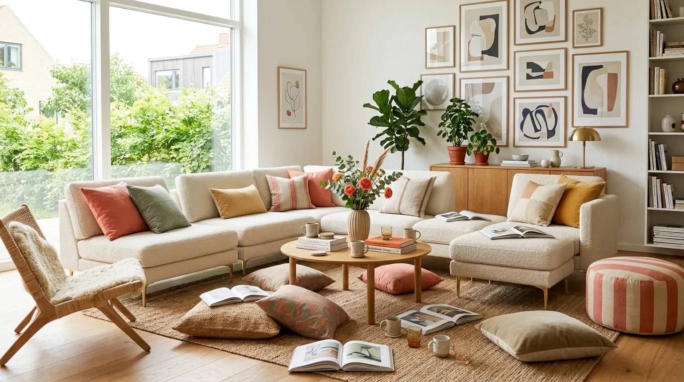
IKEA’s vibrant summer style blends clean Scandinavian shapes with saturated color, playful pattern, and natural texture. This article gives you 13 vibrant, budget-friendly IKEA-inspired ideas for bringing bold summer energy into any room.
This look feels warm, alive, and a little bit playful — like a window thrown open on the first hot day of June. Light moves differently in these spaces: it bounces off glossy ceramics, filters through sheer linen, and pools in golden patches on woven rugs. There’s an ease to it, a sense that nothing is too precious to enjoy. Here are 13 ideas worth saving — and stealing.
Why Vibrant IKEA Summer Style Works So Well
What is it? Vibrant IKEA summer style draws from Scandinavian design’s core belief in function and light, but trades winter’s muted neutrals for saturated color drawn from Swedish midsummer traditions — think meadow flowers, painted cottages, and long golden evenings. It differs from typical “Scandi minimalism” by embracing color as structure, not just accent.
Materials and colors. Expect warm butter yellow, coral red, turquoise, and grass green paired with natural rattan, seagrass, unfinished pine, and glazed stoneware. Textiles lean toward striped cotton, linen-blend curtains in warm white, and chunky wool or jute rugs that ground the brighter tones.
Why it’s trending now. Search interest in “colorful Scandinavian decor” has climbed as more people move away from all-neutral rooms toward spaces that feel personal and joyful. It reflects a broader post-pandemic shift: people want homes that feel lived-in and emotionally warm, not showroom-sterile.
Can small spaces do this? Yes, with discipline. Small-space decorators should prioritize one dominant accent color plus natural wood tones, rather than layering multiple bold hues, so the room reads as curated rather than cluttered.
Style at a Glance
| Element | Trait 1 | Trait 2 |
|---|---|---|
| Philosophy | Function meets joy | Light as a material |
| Materials | Rattan, unfinished pine | Glazed stoneware, linen |
| Color palette | Butter yellow, coral | Turquoise, grass green |
1. Sunshine Yellow as Your Accent Anchor
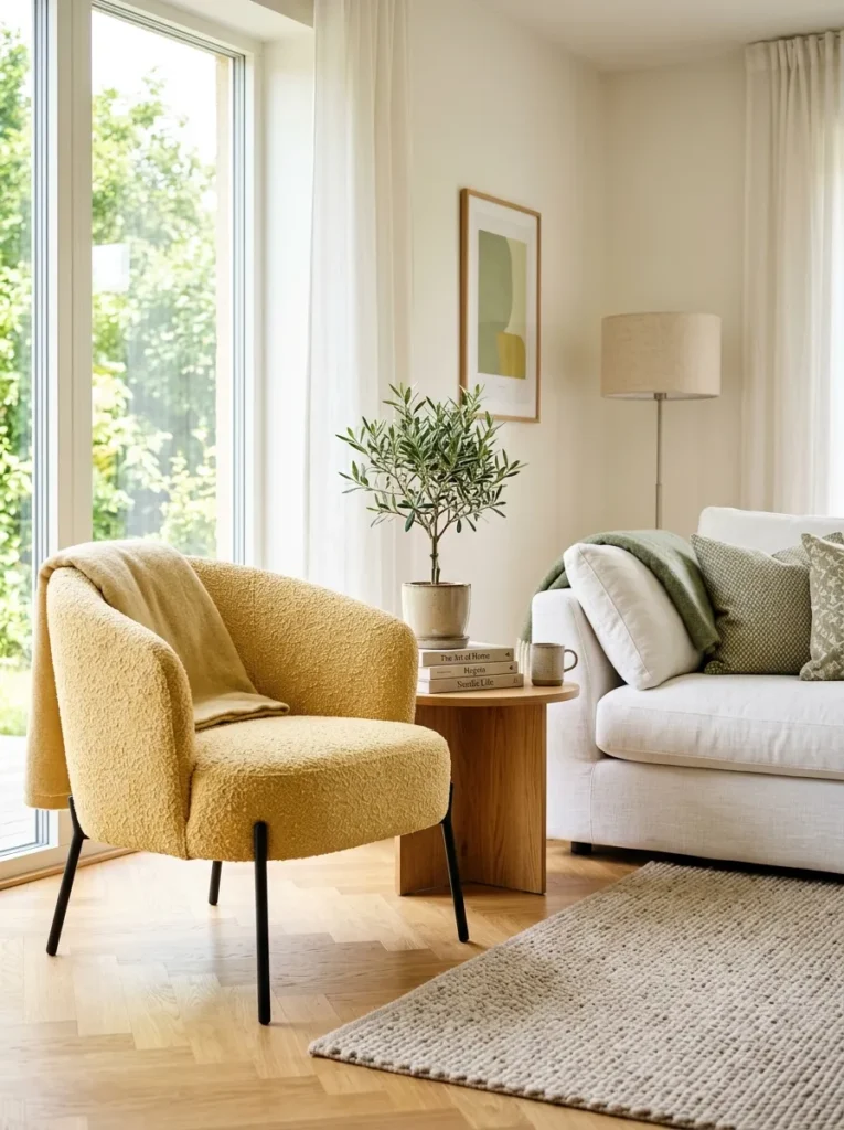
Vibe: sun-warmed and awake.
Why it works: A single saturated accent color against neutral walls creates visual weight without overwhelming the eye — a core principle of color-blocking. The yellow reads as intentional because everything else in the frame stays quiet.
How to get it: Choose one yellow accent chair or pouf and repeat that exact tone in just one smaller object, like a vase or throw pillow, so the eye connects the two points.
Quick Win: A mustard-yellow ceramic vase on a bookshelf gives you the color payoff without committing to furniture.
Shop the Look
| Product |
|---|
| Butter yellow bouclé accent armchair modern |
| Round wood side table natural finish |
| Matte black ceramic vase small |
| Sage green throw pillow cover linen |
| Warm white linen sofa slipcover |
Also view: 15 Modern KALLAX Sideboard Hacks for Stylish Homes
2. Woven Rattan and Seagrass Texture Layering
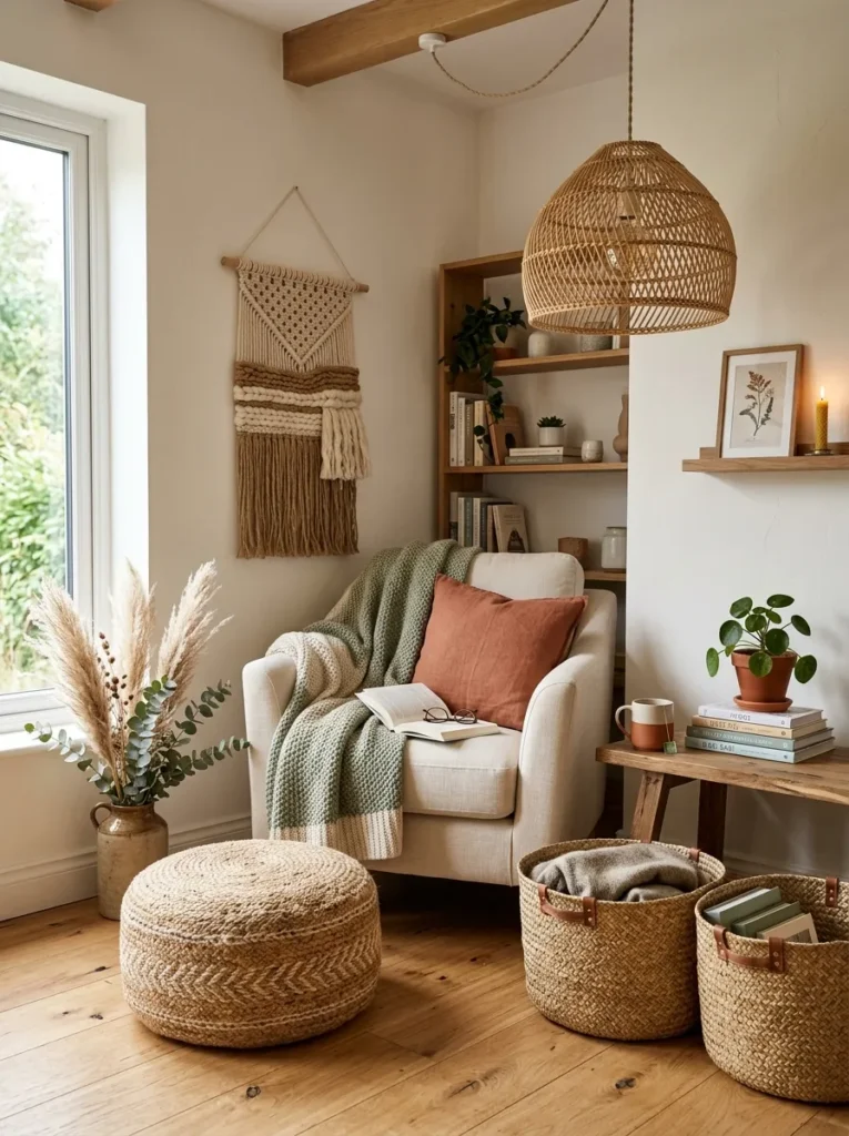
Vibe: raw and sun-baked.
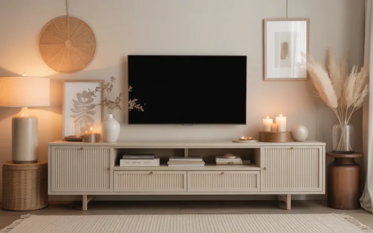
Why it works: Layering multiple natural textures at different scales — a large pendant, mid-size baskets, small dried botanicals — creates depth through texture contrast, a principle designers use in place of pattern.
How to get it: Mix at least three rattan or seagrass pieces of different sizes in one zone: one large (pendant or chair), one medium (basket), one small (coaster or tray).
Shop the Look
| Product |
|---|
| Rattan pendant light shade natural |
| Seagrass storage basket set of two |
| Jute round pouf ottoman |
| Woven rattan wall hanging decor |
| Dried pampas grass stems set |
Also view: 13 Beautiful Craft Room Ideas for Creative Spaces
3. Golden Hour Glow with Paper and Rattan Pendants
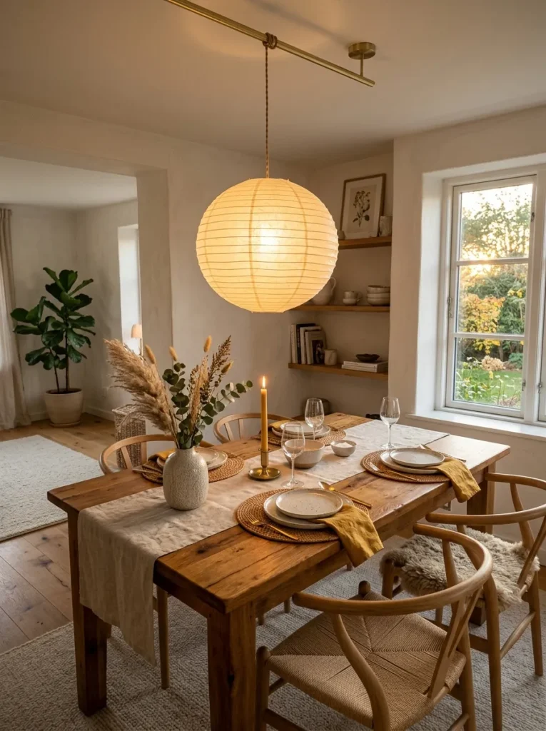
Vibe: luminous and slow.
Why it works: Paper and rattan pendants diffuse light rather than casting harsh direct beams, which softens shadows and makes a room feel warmer at dusk — a lighting technique tied to how materials scatter versus transmit light.
How to get it: Swap one hardwired fixture for a paper or rattan globe pendant hung 30 inches above your dining table for even, ambient glow.
Quick Win: A plug-in pendant kit lets you add this look without any electrical work.
Shop the Look
| Product |
|---|
| White paper globe pendant light |
| Rattan pendant light fixture round |
| Brushed brass ceiling canopy kit |
| Linen table runner natural |
| Ceramic bud vase small neutral |
4. Low-Profile Outdoor-Indoor Lounge Seating
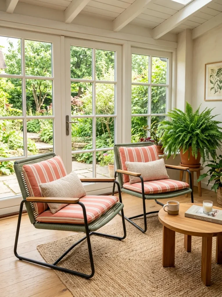
Vibe: breezy and unhurried.
Why it works: Low-profile furniture reduces visual mass in a room, opening sightlines and making ceilings feel taller — a proportion principle that matters most in sun-filled, glass-heavy spaces.
How to get it: Choose seating with legs rather than skirted bases, and keep the seat height under 16 inches to maximize the airy, floating effect.
Shop the Look
| Product |
|---|
| Woven cord lounge chair outdoor indoor |
| Teak wood low side table round |
| Striped outdoor cushion cover coral |
| Powder coated steel frame accent chair |
| Small potted fern artificial |
5. Bold Botanical Prints on Textiles
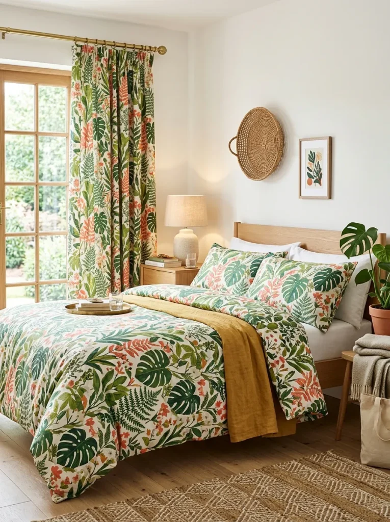
Vibe: layered and alive.
Why it works: A large-scale botanical print acts as the room’s visual anchor, allowing every other textile to stay solid-colored — a layering rule that keeps pattern-heavy rooms from feeling busy.
How to get it: Pick one botanical-print duvet or curtain set, then match your throw pillows and rug to just one color pulled directly from that print.
Quick Win: A single botanical-print pillow cover tests the look before committing to full bedding.
Shop the Look
| Product |
|---|
| Botanical leaf print duvet cover set |
| Coral linen curtain panel pair |
| Woven wall basket decor set |
| Ceramic table lamp warm white |
| Green throw pillow cover cotton |
6. Coral and Turquoise Tonal Layering
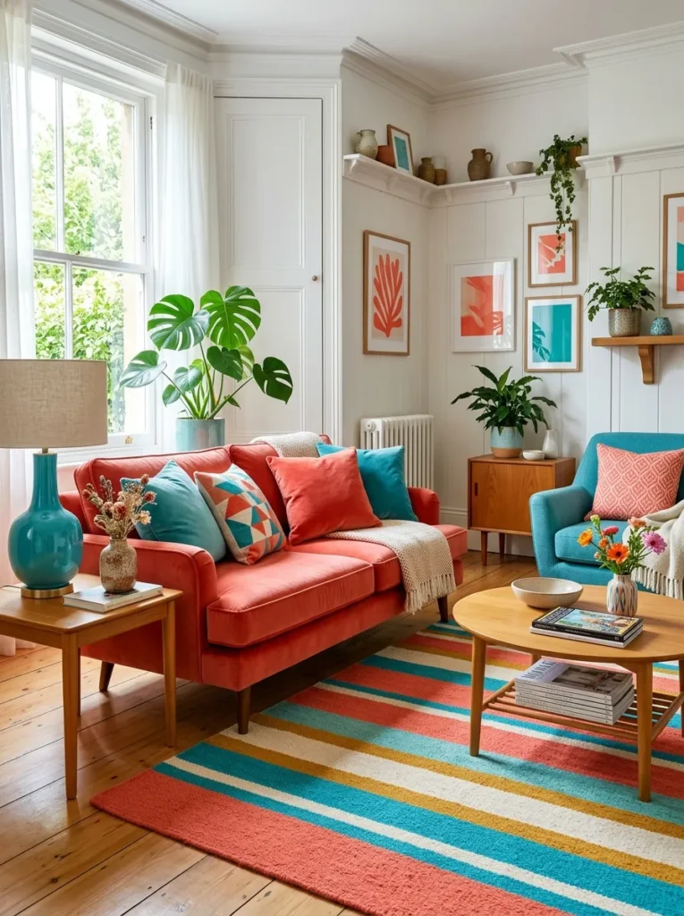
Vibe: vivid and buoyant.
Why it works: Coral and turquoise sit opposite each other on the color wheel, so pairing them in equal but small doses creates complementary contrast that reads as intentional rather than clashing.
How to get it: Use coral and turquoise only in soft goods — pillows, throws, a rug — and keep large furniture pieces neutral so the contrast stays lively, not overwhelming.
Shop the Look
| Product |
|---|
| Coral velvet throw pillow cover |
| Turquoise ceramic table lamp base |
| Striped cotton area rug multicolor |
| Turquoise glass vase small |
| Coral linen throw blanket |
7. Bright Ceramic and Glaze Accents
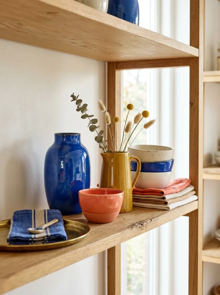
Vibe: glossy and grounded.
Why it works: Glossy glazed ceramics reflect light and add visual sparkle in a room otherwise dominated by matte natural materials, creating contrast in finish rather than just color.
How to get it: Group three to five ceramic pieces of varying heights and glaze tones on one shelf, mixing at least one glossy piece with one matte piece for texture contrast.
Quick Win: A single cobalt-blue glazed vase on a plain shelf instantly adds color without redecorating.
Shop the Look
| Product |
|---|
| Cobalt blue glazed ceramic vase |
| Coral glazed stoneware bowl set |
| Matte white ceramic vase small |
| Brass decorative tray round |
| Dried flower stem bundle natural |
8. Open Flow Zones for Indoor-Outdoor Living
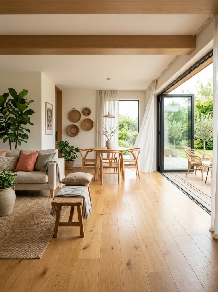
Vibe: open and unbroken.
Why it works: Using the same flooring tone and a matching rug color palette across an indoor-outdoor threshold removes the visual “stop point” at the doorway, a layout principle that expands perceived square footage.
How to get it: Choose an indoor rug within two shades of your outdoor rug or patio flooring so the eye reads the two spaces as one continuous zone.
Shop the Look
| Product |
|---|
| Indoor outdoor area rug neutral stripe |
| Low wood entryway bench |
| Sheer linen curtain panel warm white |
| Woven storage basket large |
| Potted greenery artificial floor plant |
9. Sheer Curtains for Diffused Daylight
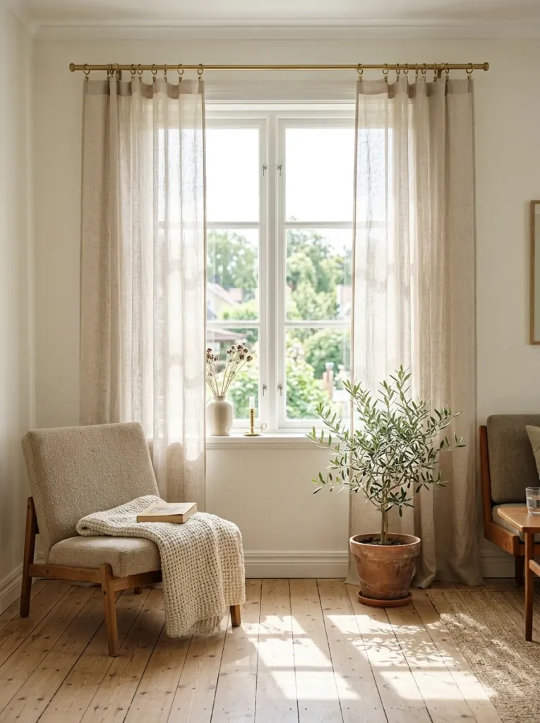
Vibe: hushed and glowing.
Why it works: Sheer linen diffuses direct sun into soft, even light rather than harsh beams, reducing glare while still keeping a room bright — a technique that relies on fabric weave density rather than blackout lining.
How to get it: Choose an unlined linen-blend curtain in warm white and hang it on a brass rod extending 4 inches beyond the window frame on each side to maximize light spread.
Quick Win: Swapping heavy drapes for one sheer panel is a same-day fix with no tools required.
Shop the Look
| Product |
|---|
| Sheer linen curtain panel warm white |
| Brass curtain rod extendable |
| Woven throw blanket natural |
| Low upholstered reading chair |
| Potted olive branch artificial |
10. Modular Seating for Summer Gatherings
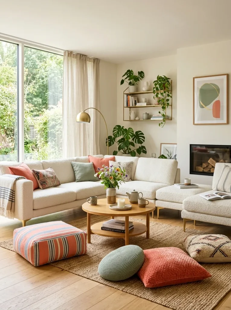
Vibe: sociable and loose.
Why it works: Modular seating pieces allow furniture arrangement to change with group size, which keeps negative space flexible rather than fixed — a layout advantage over a single large fixed sofa.
How to get it: Choose two or three modular sofa sections instead of one fixed piece so you can reconfigure the room into a U-shape for gatherings or a straight line for daily use.
Shop the Look
| Product |
|---|
| Modular sofa sectional piece bouclé |
| Low round coffee table wood |
| Striped floor pouf ottoman |
| Coral throw pillow cover set |
| Brass accent side table small |
11. Vertical Color Blocking for Compact Rooms
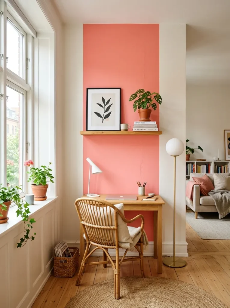
Vibe: compact and bright.
Why it works: Painting color in a vertical block rather than across an entire wall draws the eye upward, creating an illusion of higher ceilings — a trick especially useful in small or low-ceilinged rooms.
How to get it: Paint a single vertical stripe of color from floor to ceiling behind a key piece of furniture, keeping the width between 24 and 36 inches so it reads as an accent, not a full wall.
Quick Win: Removable wall decals in a vertical stripe pattern achieve this without paint or a security deposit risk.
Shop the Look
| Product |
|---|
| Coral removable wall decal stripe |
| Slim floor lamp small space |
| Floating oak wall shelf small |
| Framed botanical art print small |
| Small potted plant ceramic pot |
12. Striped Outdoor Textiles and Poufs
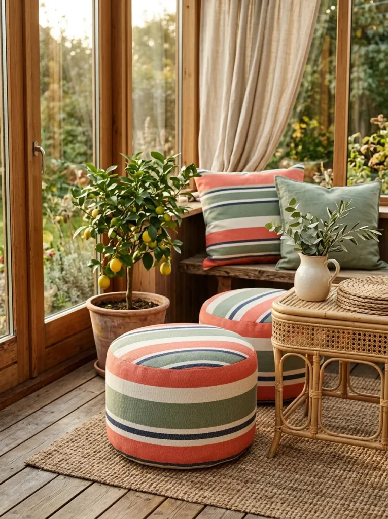
Vibe: playful and sun-warmed.
Why it works: Striped canvas textiles bring pattern without competing against a botanical or floral print already in the room, since stripes read as neutral pattern rather than a competing motif.
How to get it: Add two striped outdoor poufs in a coral-and-white or sage-and-white combination and place them at different heights — one as a seat, one as a side table topper.
Shop the Look
| Product |
|---|
| Striped outdoor canvas pouf coral |
| Rattan side table small round |
| Woven placemat set natural |
| Ceramic pitcher decorative |
| Small potted citrus tree artificial |
13. Natural Wood Tones as a Neutral Base
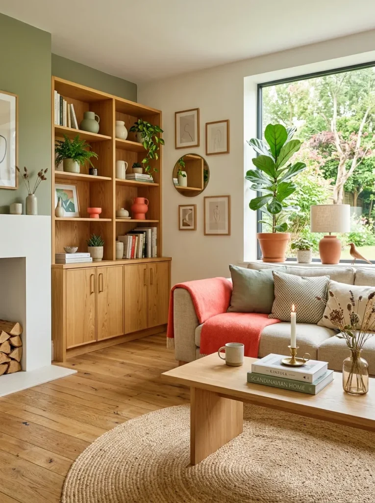
Vibe: grounded and warm.
Why it works: Unfinished or lightly oiled oak tones act as a visual “neutral,” giving bold accent colors somewhere calm to rest, which is why most vibrant Scandinavian rooms rely on wood rather than white walls alone for balance.
How to get it: Choose furniture in raw or lightly oiled oak rather than painted or stained wood, so the natural grain stays visible as a textural counterpoint to solid-color textiles.
Shop the Look
| Product |
|---|
| Unfinished oak coffee table round |
| Honey pine open bookshelf |
| Brushed brass drawer pulls set |
| Linen sofa slipcover warm white |
| Coral linen throw blanket |
How to Start Your Vibrant IKEA Summer Transformation
Start with one accent color, applied to a single anchor piece — a bouclé armchair, a painted vertical wall stripe, or a striped outdoor pouf. This single move gives every future decision, from pillows to art, a clear color to build around instead of guessing.
The most common mistake is introducing three or more bold colors at once without a neutral base to separate them. This makes a room feel chaotic rather than vibrant. Fix it by grounding every bold color choice in unfinished wood or warm white walls before adding a second hue.
Three items under $50 to start today: a matte black ceramic bud vase, a striped cotton throw pillow cover, and a small potted olive branch stem in a terracotta pot.
A full room refresh with this approach typically takes a weekend for soft goods (curtains, pillows, a rug) and one to three months for furniture pieces if you’re waiting on delivery. A starter version costs $150–$400; a full room, $1,000–$2,500.
Frequently Asked Questions About Vibrant IKEA Summer Decorating
What’s the difference between vibrant Scandinavian style and traditional Scandi minimalism?
Traditional Scandi minimalism relies almost entirely on white, gray, and beige, while vibrant summer style keeps the same clean furniture shapes but adds saturated color like coral or turquoise as a structural element, not just an accent.
What colors define this style?
Butter yellow, coral, turquoise, and sage green are the core palette, always paired with warm white walls and honey-toned wood to keep the brightness from feeling overwhelming.
How much does it cost to try this style in one room?
A starter version using textiles and small decor costs $150–$400, while a full room refresh including furniture typically runs $1,000–$2,500 depending on piece count.
Does this style work with other design styles I already have?
Yes — it pairs especially well with mid-century modern and Japandi bases, since both rely on clean furniture lines that let color do the visual work.
What’s the single most important element to get right?
Lighting. Sheer linen curtains and paper or rattan pendants diffuse daylight and golden hour light evenly, which is what makes the bold colors in this style feel warm rather than harsh.
Ready to Create Your Dream Vibrant Summer Space?
From bold color anchors and woven textures to open layout flow and small-space color tricks, these 13 ideas cover every layer of a vibrant summer refresh. You don’t need to do all of it at once — starting with one accent color and one lighting swap is the right first step. Today, try adding a single striped throw pillow or a terracotta-potted olive branch to test the palette before buying anything bigger. Once it comes together, the room will feel less like a showroom and more like a long, unhurried summer afternoon. Save your three favorite ideas now — the golden-hour pendant look pairs beautifully with the coral-and-turquoise layering, so you’ll want both close at hand.